

Sandro Botticelli was perhaps the best and most famous painter of his generation in Florence, not least because of his very distinctive personal style. Botticelli's contemporaries already appreciated this "masculine" style, presumably thinking of the striking facial features of his male figures. Characteristics of this style include high cheekbones, strong eyebrows, and sensuous lips. In addition, there is the somewhat mannered design of the hands. Often the little finger is bent to a small degree and placed at a short distance from the adjacent finger.
At first glance, many of these stylistic features apply to the Man of Sorrows, sold for $39.5m ($45.4m with fees) at Sotheby's, New York, last week. However, in my view, some of the details in the Man of Sorrows warrant a closer reading. For example, the little finger of the right hand is not elegantly bent, but curved, and in such a way that it is as if the finger is made of a flexible chunk of rubber. I find it hard to imagine that Botticelli, who of course knew his anatomy, would have made such a mistake. It is also worrying that this little finger is noticeably turned outwards, so that its fingernail appears in a slightly foreshortened perspective.
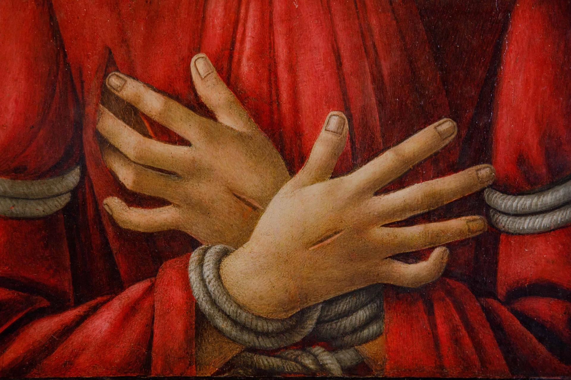
A detail of the hands
Courtesy of Sotheby's
The overall clumsiness of the hands is also striking, especially in comparison to the standards of elegance that usually characterise Botticelli's works. This lack of elegance also applies to the angels, who are arranged in a round dance around the head of Christ and carry his instruments of suffering. Rightly, this ‘halo’ of angels has been compared to Botticelli's Mystic Nativity in London. But while the angels in the London painting exude Botticelli's typical refinement and are highly individualised, the Man of Sorrows is surrounded by stereotypical figures for which I find it difficult to credit Botticelli himself. The robes look like sausages that are squeezed in by strings at regular intervals. And this design of the robes does not fit the forms of the angels, who are celestial beings and therefore should actually emanate a supernatural elegance. Unlike the angels in the Mystic Nativity, which are designed with subtlety, in the Man of Sorrows they are not.
Also among the characteristics of Botticelli's personal style is his tendency to occasionally shape the mouth somewhat asymmetrically. This stylistic feature applies to the Man of Sorrows as well. However, here the upper lip is depicted so distinctly asymmetrically that Christ's mouth is given an almost contemptuous look. This exaggeration or emphasis of stylistic features is especially known from workshop paintings. To me, the Man of Sorrows is as an example of a workshop style that adopts the individual style of an artist, but is not quite identical to it.
To make the attribution of the Man of Sorrows more credible, reference has been made to the peculiarities of Botticelli's late style. But can this explain such clumsily designed hands and rather inelegant angels? Be that as it may, attributions are not decided in a day, and controversies over the authentication of Old Master paintings are not uncommon. Examples of this abound. The attribution of the recently auctioned Portrait of a Young Man Holding a Roundel to Botticelli has long been controversial, but is now accepted by most experts. Controversial to this day is the master’s “Rockefeller Madonna” or, to cite another example, Leonardo da Vinci's Salvator Mundi. Only ten years ago, the majority of experts seemed to agree on an unqualified attribution to Leonardo. In the meantime, the majority view is probably the other way around. And if one compares the Man of Sorrows directly with the Salvator Mundi: doesn't the Salvator Mundi seem to be a much more important old master painting than the “Christ with the Rubber Hands” now attributed to Botticelli? If I had the choice (and the money!) I would definitely go for the Salvator Mundi.
- Frank Zöllner is a professor of art history at Leipzig University and the author of a catalogue raisonné of Botticelli’s works published in 2005 and republished in 2015.
- Read Bastian Eclercy's accompanying comment here