Before the 2008 group exhibition at the New Museum in New York was called After Nature, Massimiliano Gioni, the then director of special exhibitions, gave it the working title Going Native. Although it fitted with the show’s themes of reclusion, nature and ecology, it also had a whiff of something problematic. Indeed, the artist Zoe Leonard eventually protested. “It was interesting to get at that level of self-questioning,” Gioni says. “A show needs to respond to those provocations.”
When brainstorming titles, such trial and error is typical. Depending on the institution, curators will go back-and-forth with artists, colleagues, advisers and, more frequently now, marketing and public relations staff. The case of Going Native also signals the stakes involved—the curatorial pitfalls and political landmines that may linger in words. But museums stress that the process is not algorithmic but the occasionally serendipitous pursuit of a magic phrase.
Gioni, for example, borrowed After Nature from a poem by W. G. Sebald after chatting with the buyer for the museum’s bookshop “who was particularly sensitive to titles”. “The titles I like are somewhat found; they are not even made,” he says. “The best feel like they have a history, a presence, like they existed before. In a sense they’re not mine or yours; they’re ours.”
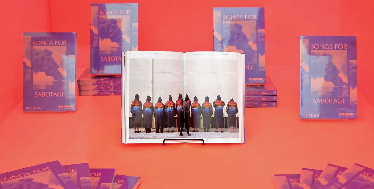
At the New Museum, exhibition titles are always curatorially driven and mirror the institution’s resistance to prepackaged meaning. The current triennial Songs for Sabotage (until 27 May) or the show Trigger: Gender as a Tool and Weapon, which closed earlier this year, resist the teacherly, didactic conventions of exhibition titling. Gioni personally likes to talk about “atmospheres, experiences and modes of being, even sensations, and unquantifiable and impalpable quantities.”
Others are trying to strike a balance between clarity and intrigue. “We’re all aware of the challenge of exhibition titles,” says Kevin Tucker, the chief curator at the High Museum in Atlanta. “We’re not always willing to break out of those typical didactic structures. But as we move to a more sophisticated consumer of art and media, we have to do something that goes beyond what we’ve been doing in the past.”

The High Museum of Art is moving towards using more dynamic language Niels Borch Jensen Gallery and Editions
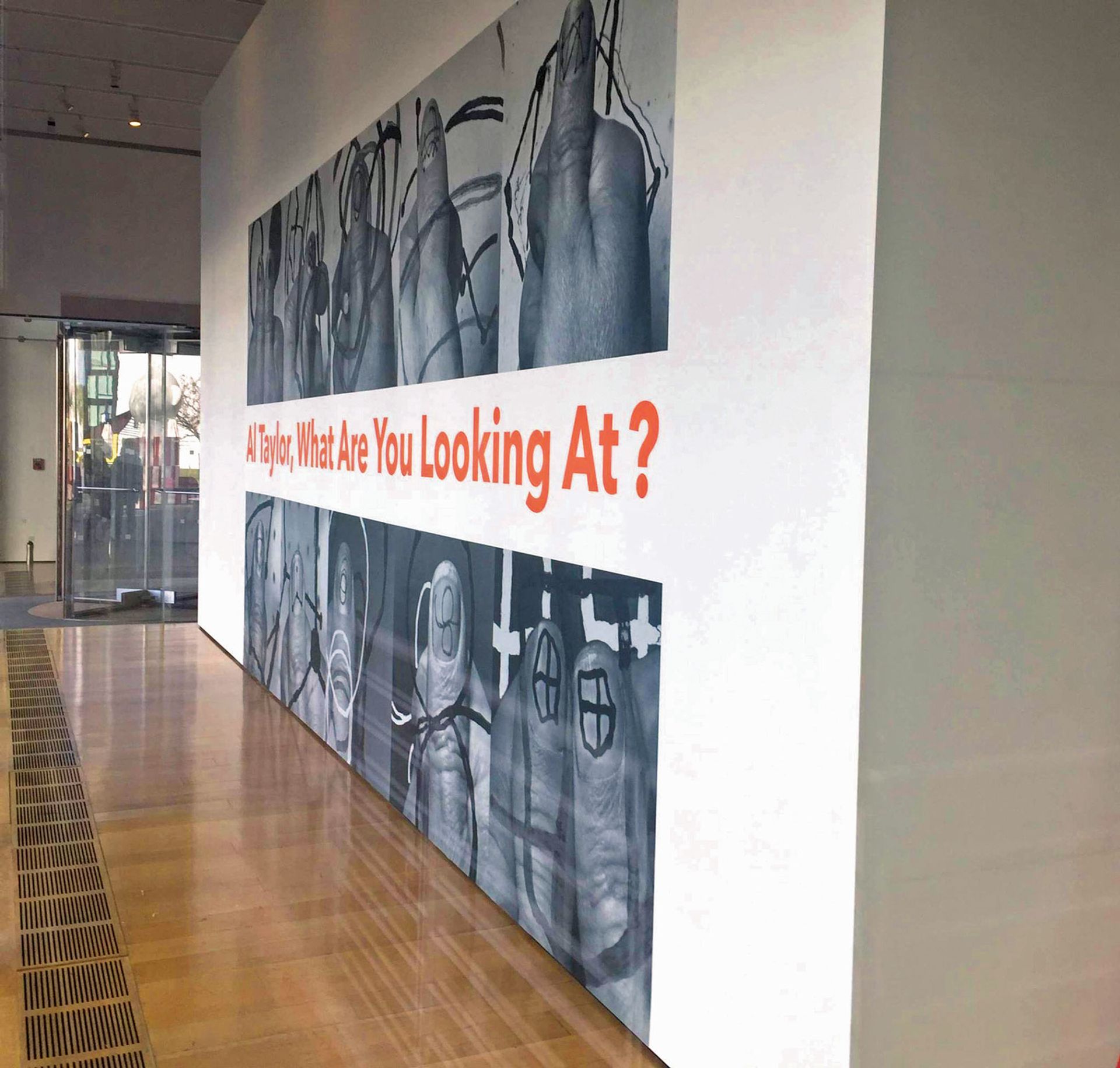
The High Museum is now restructuring its exhibition review process: curators will collaborate directly with press and marketing teams. Titles will prioritise active phrases over academically passive ones, and viewer participation over finalised theses. The museum’s recent show, Al Taylor, What Are You Looking At?, proposed a more dynamic future for titles, and even escapes the ubiquitous, pesky colon.
“At the end of the day, every curator wants their exhibition to be well received,” says John Giurini, the assistant director for public affairs at the J. Paul Getty Museum in Los Angeles, who often works closely with curators to refine their titles. “Nobody wants to create an exhibition that no one understands or that—god forbid—has a title that turns people off.”
Such conversations can extend beyond a museum’s walls. The Block Museum of Art at Northwestern University in Evanston, Illinois, enlists national and international experts to assist with titles. Its 2016 travelling exhibition on the artist Charlotte Moorman was nearly called Think Crazy—a reference to the slogan used to promote the New York Avant Garde Festival founded by Moorman. But advisers insisted that it would reinforce longheld perceptions of artists as unserious or loony, and so instead chose A Feast of Astonishments: Charlotte Moorman and the Avant-garde, 1960s-1980s.
“I think you can get into pitfalls if you haven’t clarified your thesis,” says Kathleen Berzock, the Block’s associate director of curatorial affairs, adding that a curator’s personality is an unavoidable ingredient. “Often these are big projects that you spend a lot of time on and are really passionate about, so there is an element of personal taste, likes and dislikes,” she explains. “It’s not a science.”
Social media is not a key consideration because an exhibition will often have a separate hashtag. The Getty is not unusual in that it thinks more about street banners, where concision is a top priority. “We want to make sure it’s not an exhibition you’ve seen before, or that someone has done before,” Giurini says. “We want to make sure there’s a little bit of—for lack of a better word—sexiness to it.”


