Today, the museum continues to evolve in different directions as vigorously as the art market fluctuates. The growth is not unpredictable but is certainly divergent, as if curators and museum directors were competing as much as artists in trying to pre-empt the zeitgeist. Since the millennium, stylistic trends have remained oppositional—neutral white cube versus context-specific design, or monist versus pluralist expression. New contrasts have emerged, and social forces still drive this increasing diversity, as much as the $60bn art market.
For The Art Newspaper in 2000 I summarised some of those forces behind the culture industry. They produced that recognisable type, the iconic building and its mega-collections, the Bilbao Effect, which rust-belt cities tried to induce. At least for architects, this was liberating, allowing them to experiment with unusual freedom. By 2005, most global capitals, especially sovereign funds on the Oil Road to China, sought starchitects (when this epithet caught on) to further their fortune. Their names appeared on Wikilists, as predictably as the top 100 artists who dominated the world art market. I ended my millennial survey with the hope that the Spectacular Museum would face its spectacular contradictions with a more complex architecture; and that it would take on a more spiritual role in a post-Christian age, left by the collapsing church. After all, the “museum as cathedral” has been a cliché for over a hundred years, and we live in a time when our new cosmic world view has become public and known globally. Face up to the realities or suppress them?
Modern architects committed to abstraction, and a universal language based on technology, have for the most part avoided such questions. They continue to feature generic solutions but, at the same time, are not immune to the Bilbao Effect. Renzo Piano’s new Whitney Museum of American Art in New York is the typical result, neutral in its techno-realism but captivating in the way it performs in the industrial city by the Hudson River, its framed views of skyscrapers and its cascade of terraces over the High Line. Modernist neutrality is the idée fixe of Minimalists and the best way to face an agnostic audience, so it is no surprise that it still dominates museum design either as the white cube or the industrial shed. However, the more sophisticated media-driven audience can find this detachment underwhelming or even retro, a complaint heard about the new Whitney and so much other Modernist work. David Chipperfield’s Jumex Collection in Mexico City and Herzog & de Meuron’s Pérez Museum in Miami are both decent and inventive essays in the already said and, like Piano’s industrial vernacular, city-oriented icons. They all punctuate museum fatigue with fantastic glimpsed views outside, leaving the iconic role to nature, the city or the well-framed art.
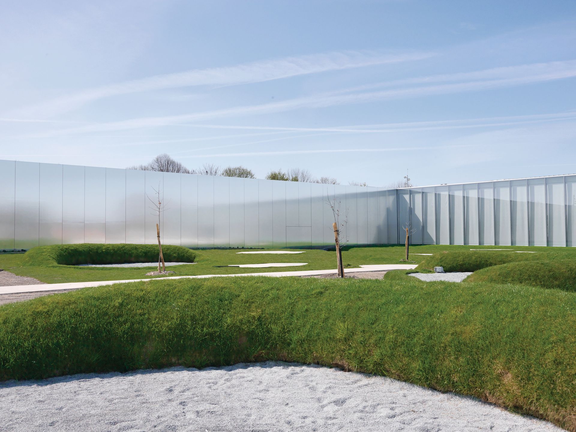
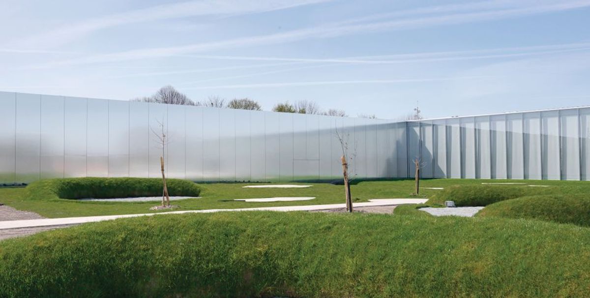
Minimalist masters Masters of the Minimalist museum show what architects have known since Le Corbusier celebrated the beauties of Purism and the sacral nature of reduction. Mies van der Rohe worshipped “almost nothing” in architecture, and the “presence of the absence” has been a positive goal of two recent movements, Late Modernism and Negative Theology. All this is evident in Álvaro Siza’s Portuguese museums, Peter Zumthor and his Swiss reductions, and particularly Kazuyo Sejima with her Louvre Lens. Here, the eliminative strain of Cistercian architecture is taken to a new level of absence where the background to art all but disappears yet still gives shelter and excitement.
David Chipperfield is known for his Minimalism, so it is a surprise that his Neues Museum in Berlin (2009) has led the Post-Modern movement towards a new departure of what I have called the Time City. Here past, present and future are all mixed creatively, with different techniques employed for particular parts; many site-specific architectures, as it were. The Time City as a concept is as old as the palimpsest and the reuse of past fragments in new ways; it’s a transformative role for the past, not a passive revivalism.
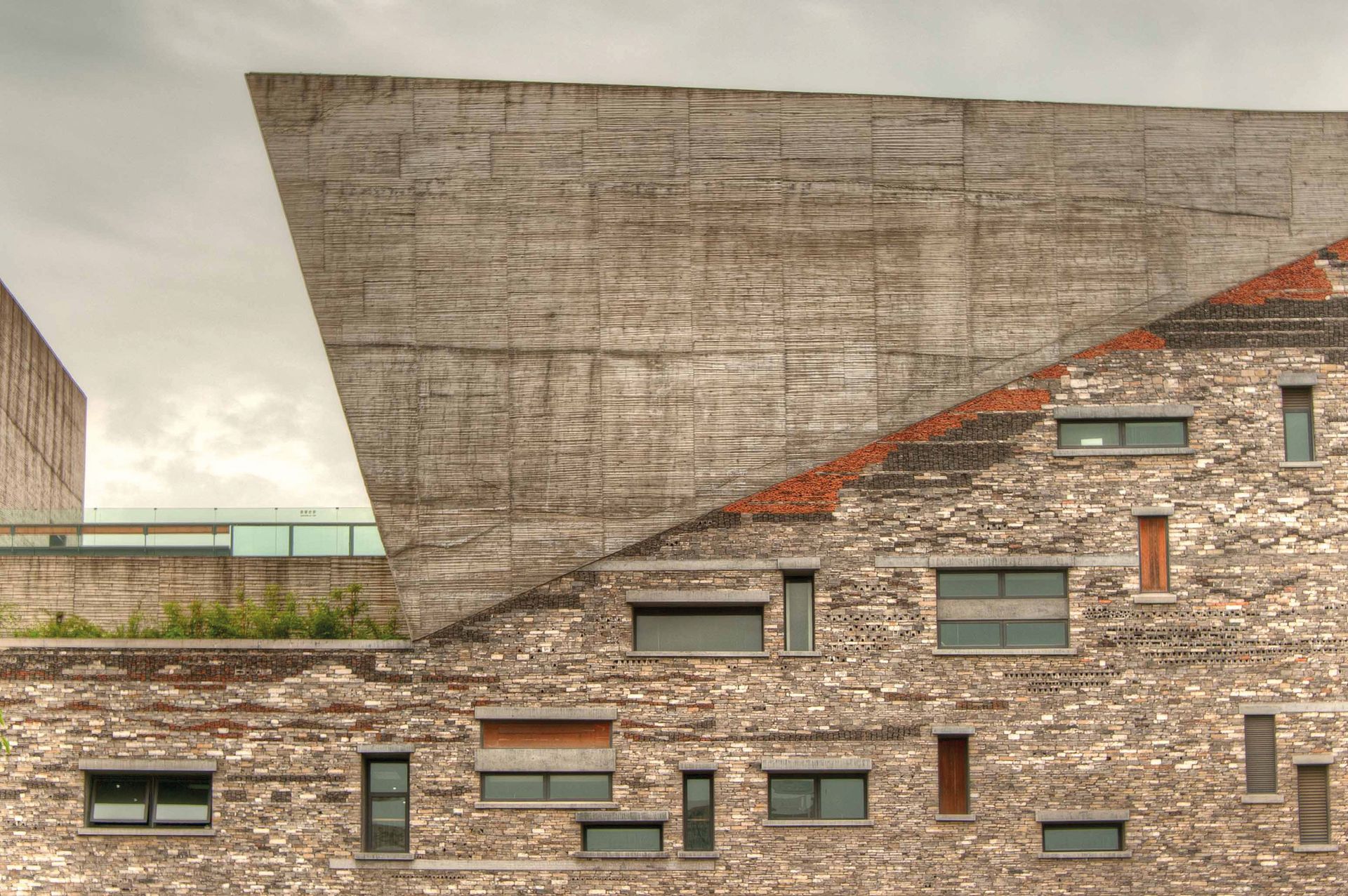
Finished at the same time was Wang Shu’s Ningbo History Museum. It’s a similar collage of fragments from the past, appropriate to the building’s role of summarising local culture, now being destroyed by turbo-charged capitalised-communism. A friend of Ai Weiwei, who was also using historical spoliation ironically and politically, Wang immediately won the top Chinese architectural award in 2009, and the Pritzker in 2012. His museum introduced at a stroke a new, peculiar beauty, the completely cannibalised corps exquis of individual elements. This industrial scale ad-hocism, Wang argued, was less expensive than modern prefab production methods, and could be representational as well. The corner tilted volumes reflect nearby mountains, the undulating tiles collaged in the walls recall the sea and its importance for Ningbo, and its past is echoed by the use of bamboo shuttering and the millions of bricks from a tradition being bulldozed into oblivion. Like Ai Weiwei’s polemical reuse of history in a radical present this becomes a paradoxical time-bender: a MOCA (museum of contemporary art) of the past, making the point that spoliation has its own kind of memorialising beauty and economy. Wang calls his group Amateur Architecture Studio and it is fascinating that another polemical collective working far from the centre of power and money, We Architech Anonymous (WAA) has produced another world-class museum, the Yinchuan MOCA in the north-western province of Ningxia Hui. With its twists, warps and symbolic references to the sea in white GRP (glass reinforced plastic) panels, it is one more oblique reference to nature in general (and similar to the San Francisco Museum of Modern Art). Perhaps in both these important Chinese museums, the past and a generalised spiritual content is more easily expressed in the periphery than the centre of power.
Koolhaas the surrealist
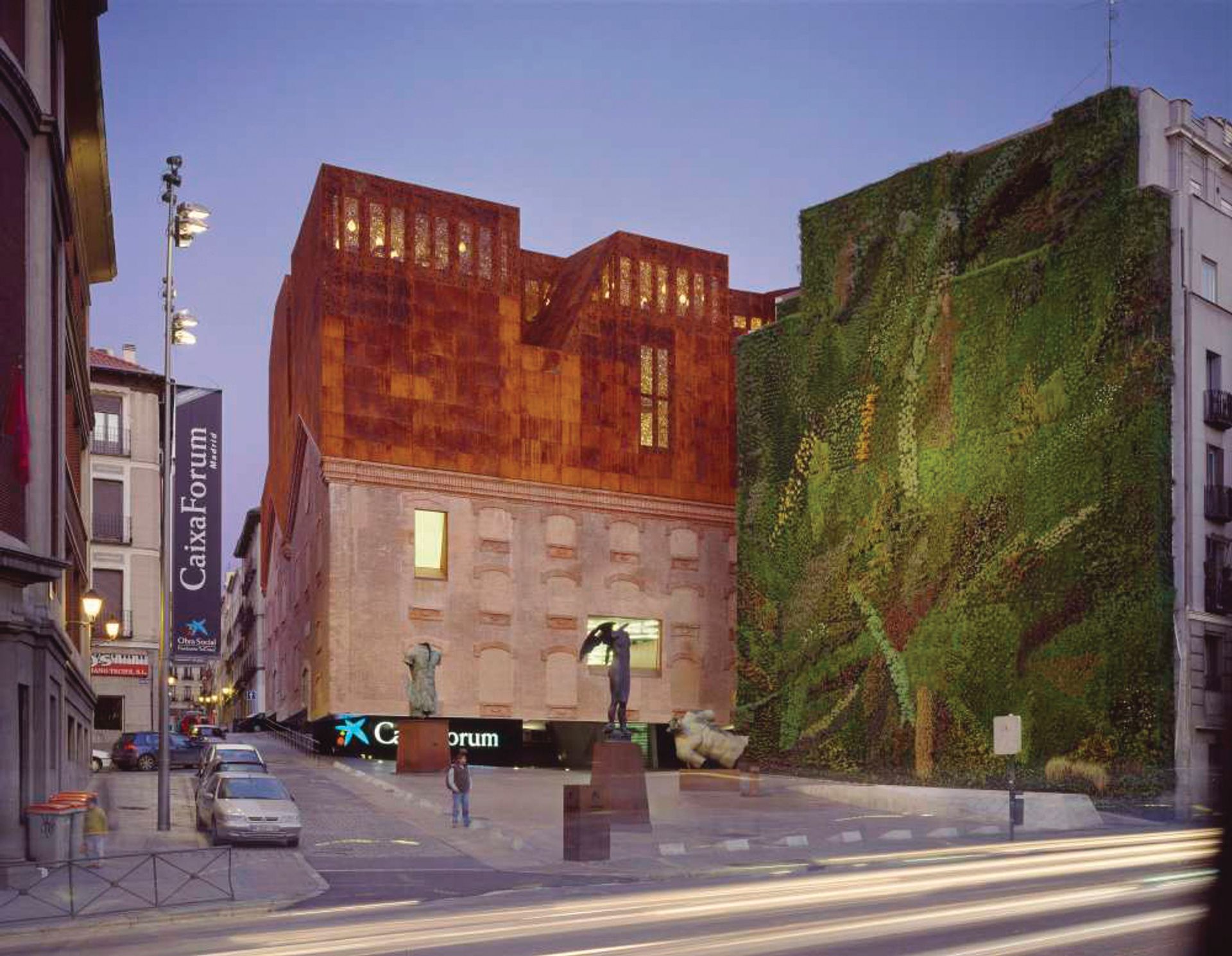
Herzog & de Meuron’s CaixaForum in Madrid, started in 2001 and finished in 2008, shows that it takes time and careful patience to bring off a convincing mixture of eras and meaning. What starts as practical reuse can end as expensive but brilliant opposition of moods, like a cathedral built over centuries. This museum (more a kunsthalle of contemporary art) is perhaps the most resolved and musical expression of the Time City to date.
Rem Koolhaas followed with two stunning essays in the genre, Moscow’s Garage, a collage of a 1960s collectivist restaurant with a giant grid of elevated walls that reveal Gorky Park to all sides. Flat translucent polycarbonate walls play a leading role—industrial-scale glistening plastic planes rise up or fall down over the art pilgrims.
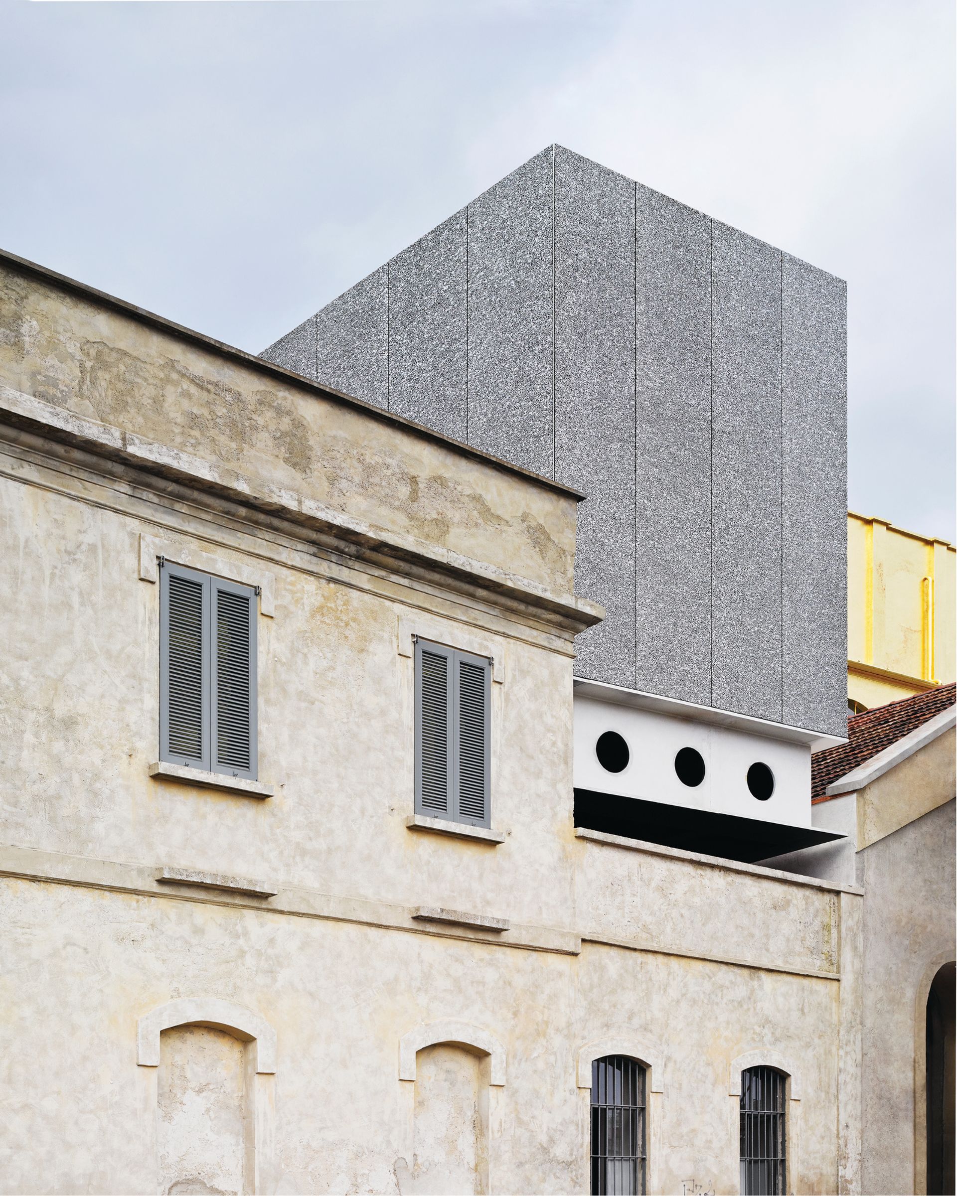
More convincing, because more complex at the city scale, is his Fondazione Prada in Milan, also completed in 2015. This is a stunning amalgam of vertical and horizontal blocks, and fragments from the past. A “haunted house” painted in gold leaf contains private galleries devoted to individual artists, versus a set of pitched-roof galleries devoted to art movements, versus a “great hall” reused from the past (reminiscent of the Pompidou Centre and its giant multi-use space). As he juxtaposes one use and era with another, Koolhaas the Surrealist is, of course, reminting the old game of le corps exquis. The whole Prada makeover thus has an uncanny air. It is at once like the heyday of Italian Neorealismo film and Goldfinger, Arte Povera and utopian industry. Finally, the articulation of difference reaches the complexity of contemporary reality: today’s mega-museum really is a mixture of hype, hope, passion and banal bigness.
Cosmic metaphors Many Modernists have left the high church and adopted the iconic genre for all sorts of reasons. I. M. Pei, in his late period, has sought a seamless mixture of past and present in his Chinese and Doha museums, but what they gain in suavity they lose in personality. Chipperfield has, by contrast, found the perfect foil for his Minimalist sensibility in the Hepworth Wakefield, a good example of the artist-led museum where the work and its sympathetic display really do become what all artists must hope for; the perfect frame and accompaniment to their message.
Two striking transformations of a Modernist into identity-led Post-Modernist are Jean Nouvel and Norman Foster. The former had a hint of this change to come with his Institut du Monde Arabe in 1987, with its brise soleil based on photovoltaic shutters that, like a camera-eye, closed down in Islamic patterns to vary the light. In 2010 he designed the new National Museum of Qatar based on “the local desert rose”, with intersecting blade-like petals of steel covered in sandy gypsum. As with his Louvre Abu Dhabi, a billion-dollar building probably opening next year, the Post-Modern double-coding is explicit. Nouvel intends “to mirror a protected territory that belongs to the Arab world and this geography”; to provide “an oasis of light under a spangled dome at night” (like his 1987 building but now with Islamic patterns overlayed). He wants it to provide a “rain of light” of 8,000 stars, reminiscent of mashrabiya windows and the beams of light that illuminate the souks; he wants to recall the traditional falaj canals and use water to reflect light upwards on this vast flying saucer of a dome with its 2,000 ft circumference: “The white dome is their symbol for sacred spaces. A museum is a spiritual place, even if it isn’t connected to religion.”
Indeed, spirituality existed for 70,000 years before organised religion, if anthropologists’ hunches about Africa are right. Today’s shift from particular religions to a generalised spirituality is a global trend noted by architects as well as theologians—Daniel Libeskind has spoken about it since his design for Berlin’s Jewish Museum in the 1990s. It is most evident in the way the iconic museum employs connotations to nature and the cosmos. Since Norman Foster has been designing icons, such as the Berlin Reichstag dome and London Gherkin, roughly one-third of his recent large buildings have employed a mixture of allusive metaphors and explicit references to nature. His Zayed National Museum, near Nouvel’s Louvre in Abu Dhabi, is basically an energy-saving design with five steel wing-tips providing the natural ventilation as they soar above a tiered garden—housing the museum—to catch the breeze. The wings become an explicit memorial to the late Prince Zayed and his love of falconry, as much as the ecological structures become cosmic metaphors.
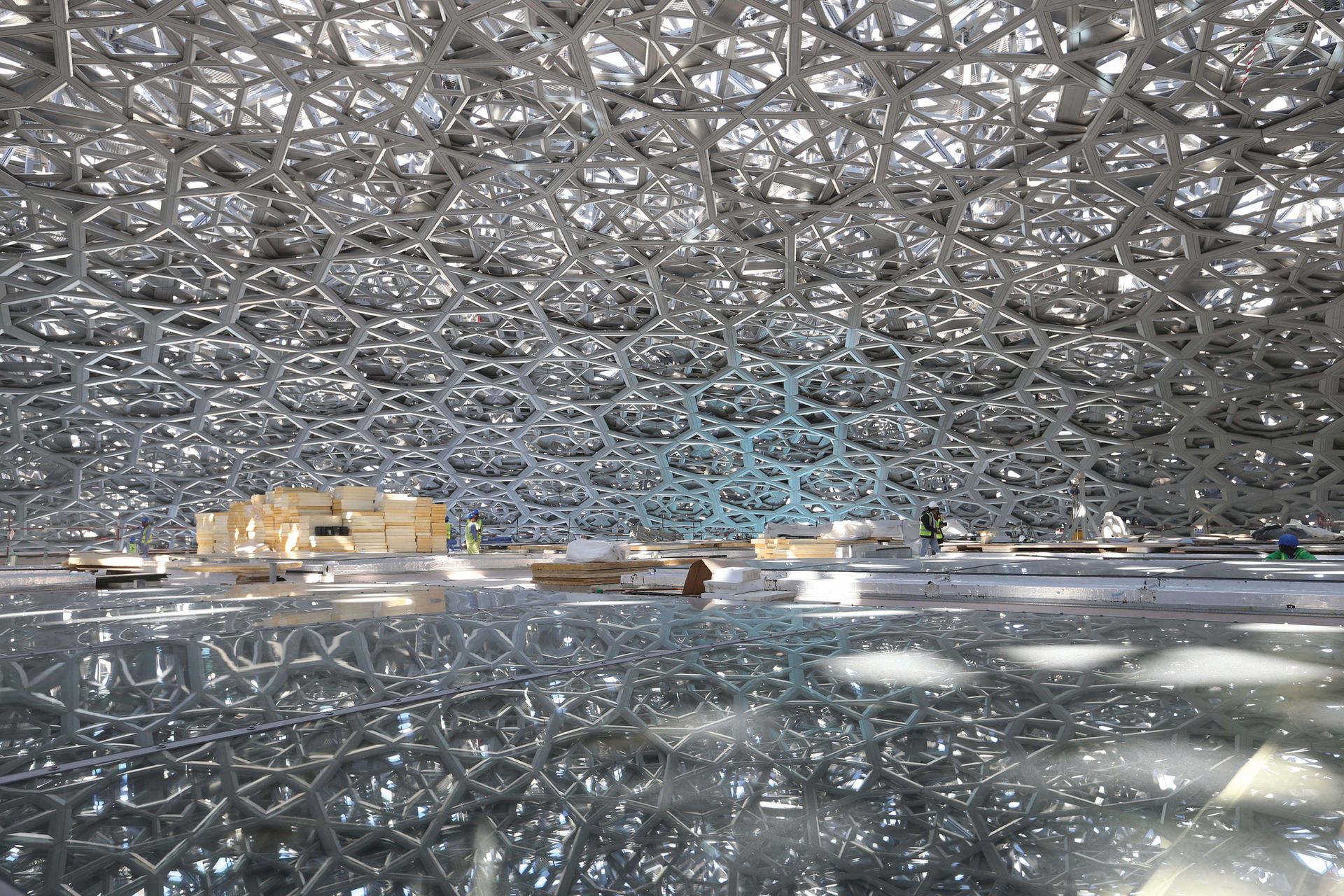
Mother Nature Nature and the universe are never far away from the architect’s mind when designing the most visible or expensive buildings today. The cynical reason is that megabuildings cannot hide and must look like something more than a dumb box, so, in a fiercely secular age, the default mode must be nature, sustainability—the most unimpeachable of faiths. Foster, Nouvel, Libeskind and starchitects are as aware of this fact as startists (to coin a phrase), but they are also positively inspired by wave forms, fractal shapes, indeed any forms of self-organisation that emerge in the cosmos. This perennial love of nature’s patterns is built into architecture because its structures and details derive from the laws of nature, are biomimetic from birth. Hence when clients are confused, society does not know what buildings should look like, religions have lost their credibility and the mediated celebrity age has become dominant, the only saviour left is Mother Nature. That, in a nutshell, is why the contemporary museum is looking like the Cosmic Cathedral today, with a difference. The imagery must also be allusive, suggested, connotative because there is no global religion or equivalent ideology to back up an explicit iconography.
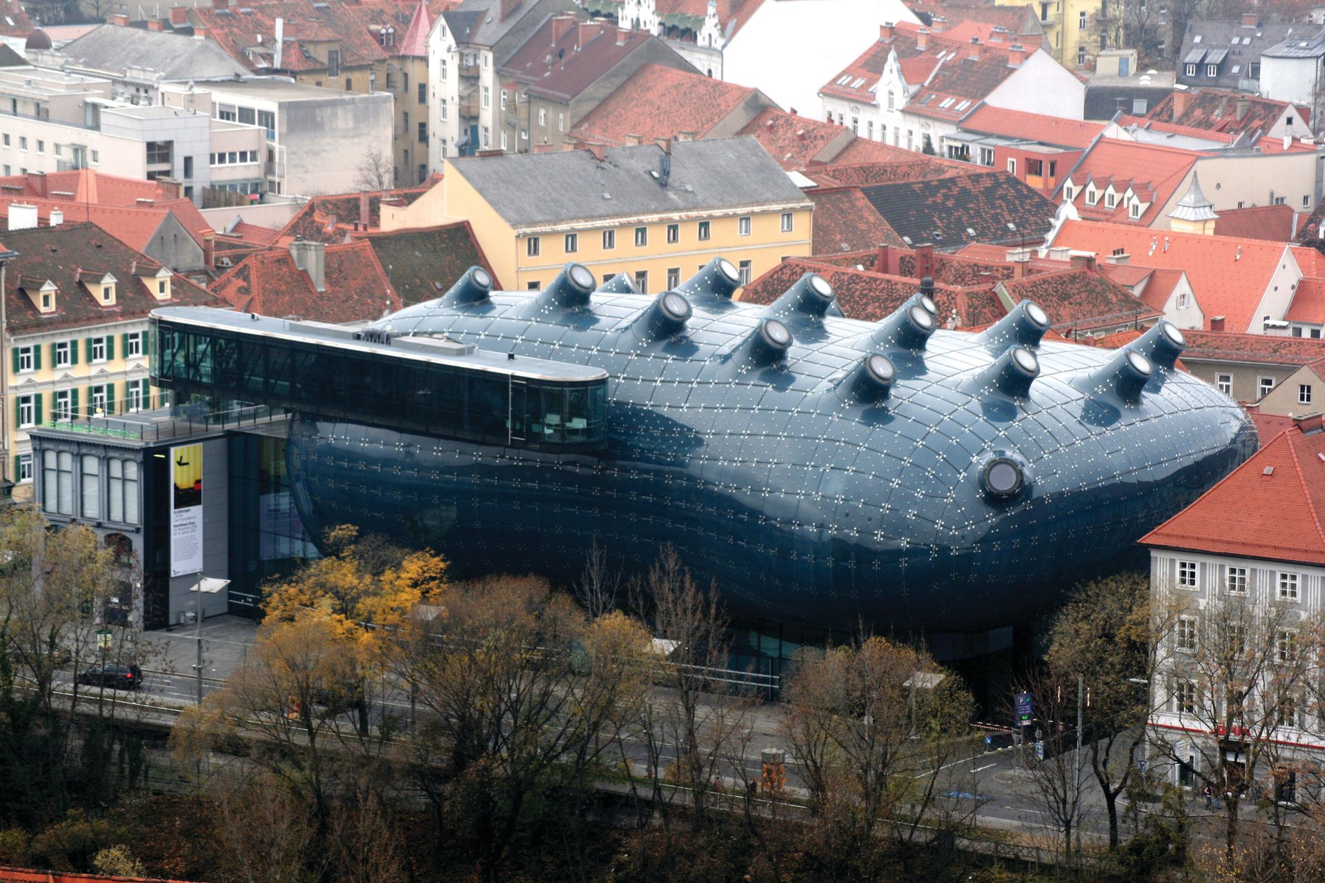
This is why most of the iconic museums since the year 2000 are Cryptic Cathedrals that diffuse their general spirituality through multiple metaphors that only suggest nature. Peter Cook and Colin Fournier’s Kunsthaus in Graz is a floating body with many eyes or appendages waving to the north-light, a “friendly alien” as it is known. Coop Himmelb(l)au’s Musée des Confluences in Lyon is not only a confluence of two rivers and movement, but it is “cloud” and “crystal” and “geological strata” all wrestling inside the body of another friendly alien. Moshe Safdie’s Crystal Bridges Museum in Arkansas is, as its name proclaims, another crystal metaphor (probably the most shared icon in today’s architecture); here it is mixed with organic and fluid similes, especially because it is designed around creeks and ponds. With Snøhetta’s new expansion of SFMOMA the architects refer to the white undulations as recalling the “fog and mists” of the city, though most people might see these ripples with black cracks as more like white cliffs broken by horizontal strata. Indeed, the geological metaphor comes naturally to architecture, augmented by John Ruskin’s many sermons on its religious relevance for man.
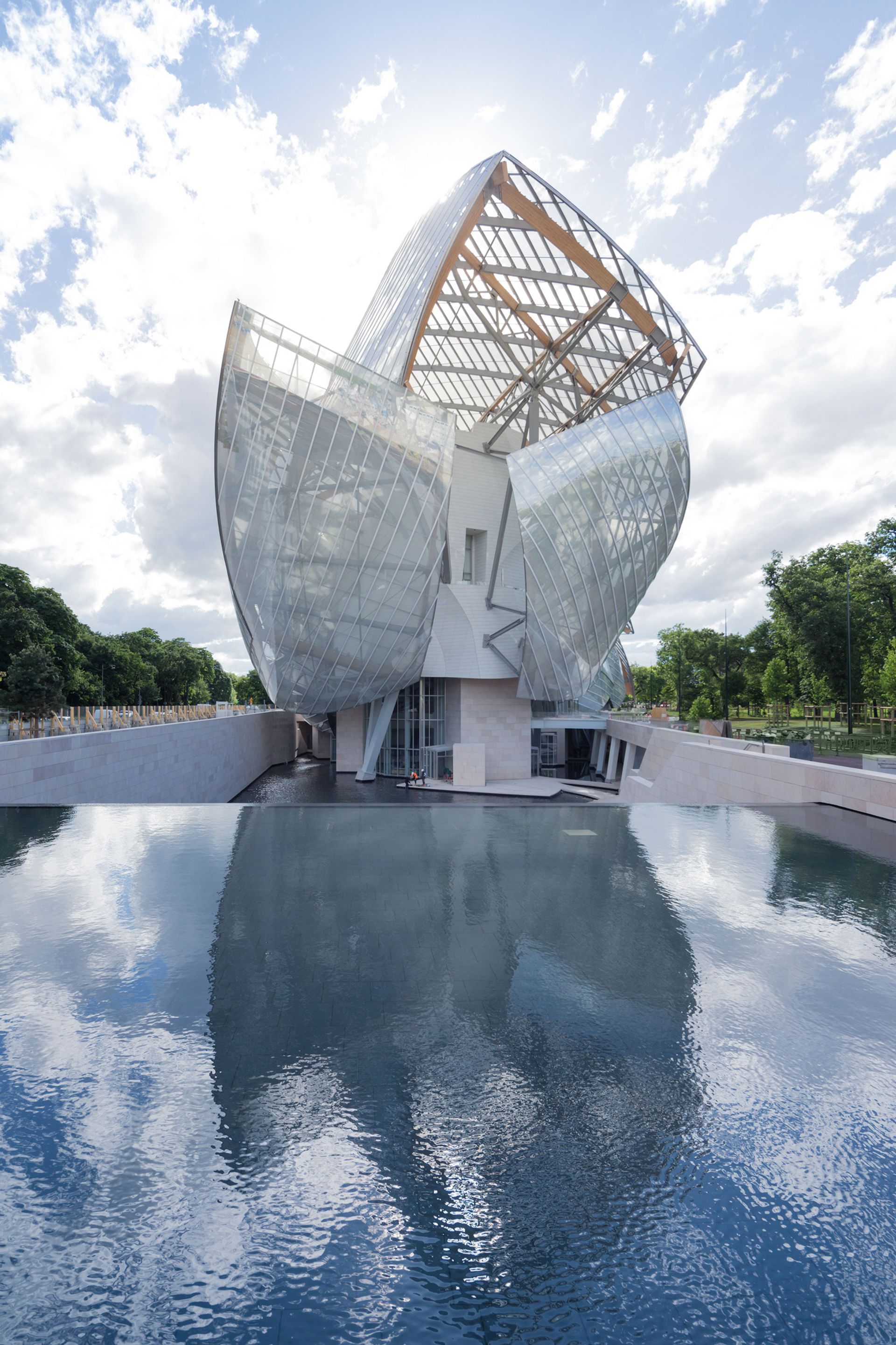
Perhaps the most vigorous set of metaphors struggling together is Frank Gehry’s Fondation Louis Vuitton in Paris, a direct descendant of his previous Bilbao Effect in important ways. It reuses the grammar of fluid vesica shapes, now in transparent glass not glistening titanium. These curved shapes recall the shells of the Sydney Opera House—and shells are good structural forms—as well as the pleats of sails and spinnakers, ever a Gehry image because of his love of sailing. Looked at in plan or from the air, the mixture of blocky functions and glassy shells becomes clear. The opposition can include minimal white and black cubes, utilitarian and cheap space, and contrast them with free-form sails. It also becomes apparent, from views through the woods, that Gehry’s eruptive body twists slightly towards its head, that these billowing shards of glass, with their tectonic pleats, move like a slouching beast away from the roadside traffic. The body may not be as common a metaphor with contemporary icons as the crystal and geological strata, but faces, arms, buttocks and breasts have been suggested since the time of Le Corbusier’s Ronchamp Chapel, the first great icon of Post-Modernism, back in 1955.
There is much to say in favour of Gehry’s work in his late style, and against the waste of good sculptural space under the glass sails, but this is not the place. The more general point is the way the building typifies the overall evolution of recent museums towards the Cosmic Cathedral that is at once suggested yet still not named. It is one more Monument to the Unknown Meaning, of a building type that cannot speak its spiritual mission yet cannot resist implying it with all its might and money. In the way that De Chirico, a century ago, said he painted “the enigma”, perhaps, like so much contemporary art, it is the enigmatic signifier that it signifies most clearly.


