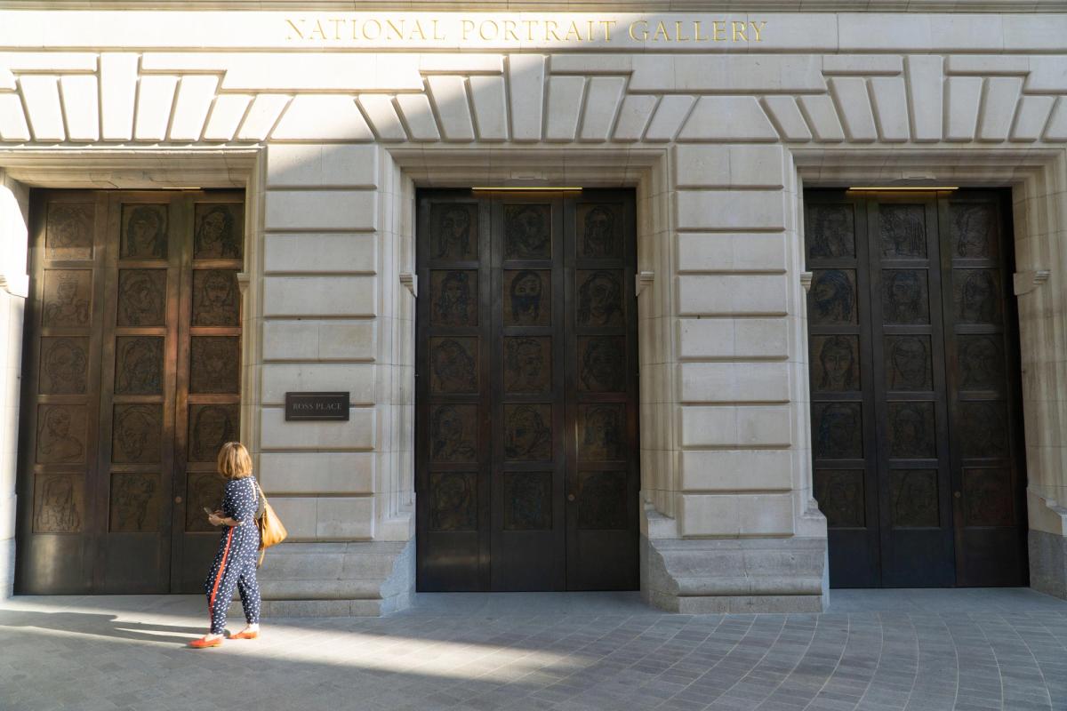
If I read one more review of the new National Portrait Gallery (NPG) saying the old gallery was “dusty”, I shall explode. What a slur on the NPG’s former cleaning staff! There was ne’er a speck in the whole place. If you really want to see a dusty gallery, go to the Louvre in Paris and look at any picture hung above head height. Those frames are thick with dust.
But even allowing for “dusty” as the now ubiquitous museum metaphor for anything older than a decade, I wonder if it’s also a little unfair on previous NPG directors and staff. It has been said the NPG used to be “old and dusty, dark and boxed in”. Was it, though? I liked it, but perhaps the “old and dusty” charge was necessary to raise £41m from donors. We will have to let visitor numbers provide the ultimate verdict; 1.5 million pre-closure (2 million pre-Brexit).
Nonetheless, completing the refurbishment on time and on budget during a pandemic is an extraordinary achievement by the NPG’s director, Nicholas Cullinan, and his team. It was good timing to plan an orderly museum closure just before Covid forced a disorganised one. That they completed the project while raising £25m to help keep Reynolds’s Portrait of Mai (Omai) on public display is even more impressive. Cullinan and co deserve their plaudits, and I’m looking forward to visiting, relieved my favourite gallery is back in business.
In the meantime, like everyone else living outside London, I will have to rely on the NPG’s website, which remains lamentable. The collection database is clunky, the photographs inadequate, and you’re lucky to find more than a few lines of explanatory text per painting. Which is a shame, since understanding portraits depends on knowing the stories behind them. We’ve seen the same phenomenon at Tate Britain after its rehang. Millions spent on new displays and labelling, but the website is like stepping back in time, the old gallery text still there, and the photographs even worse than the NPG’s.
Can our national museums please think more about the “national” part of their mission? With travel to London increasingly unaffordable, spending millions on physical galleries while neglecting the digital one used by far more people feels unbalanced. In an online world, a good website is a more important front door than an actual one—even if it is designed by Tracey Emin.
And there’s another reason why any “new” rehang or gallery should go hand in hand with a new website. These days, with a world of information available in our pockets, it’s possible to let audiences engage with the art on display as never before. We have surely moved beyond the limitations of wall labels with just a few lines of explanatory text. The V&A used to advertise itself with posters saying, “An ace caff with quite a nice museum attached”. In the future, successful institutions will be those that have an ace website, with the museum attached.
That’s why, if I had £41m to spend on a museum refurbishment, I’d start with two things: a better website, and more curators. I’d make it the museum’s mission for as many people as possible to know as much as possible about the collection, wherever they are, which would enrich their experience if and when they make to the museum. A challenge would be, however, how to raise that £41m. Donors want their name carved above a door, not at the bottom of a website. Unless of course, I could persuade them the old website was dusty…


