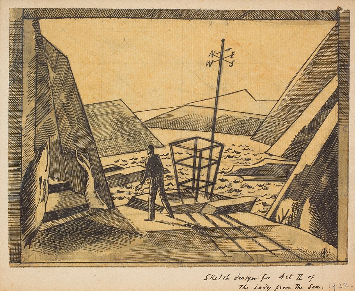
This unusually beautiful octavo book shows that the design work of English surrealist, landscape painter and official war artist Paul Nash (1889-1946), although spasmodic and commissioned in many media, was a central part of his production. This is a historical survey not a catalogue, but includes everything from bookplates and book jackets to posters, fabrics, ceramics and even an entire bathroom.
Design was a vital source of income as Nash and his wife, the writer and suffragette Margaret Odeh, were forever short of money, but King shows that more fundamentally it was design that, at times, drove his creative vision. This was significant when, recovering from depression following the Great War, he was inspired by the actor, director and theatre designer Gordon Craig to consider designing for the stage. From that time it is evident that Nash was able to see in landscape a sense that objects were put there for some hidden narrative expression, and to manipulate and find eloquence within a not quite natural scene.
King has already published a biography of Nash, but there is enough enchanting detail here around the circumstances of the design commissions that, although never solicited by Nash, seem to have arrived at just the right time to further his vision. Nash, while no scholar, responded to the free-thinking prose of Sir Thomas Browne’s Urne-Buriall (1658)—a meditation on death and burial stimulated by the discovery of Anglo-Saxon pots in Norfolk—to let rip with the type of surreal illustrations that are the best access to his fundamentally illogical way of thinking. The accumulation of design in the book also suggests that Nash’s imagination was graphic and word-driven, rather than an affair of mushy colour and paint.
But is it right to think of Nash, as King does, as hesitant to “make use” of surrealism and nervous of abstraction? Nash seems to be a confident artist of his own kind—not a follower—committed to landscape from love rather than nostalgia. He was embarrassingly patronising to artists he encountered on his one trip to New York in 1931. He got on quite well with Henri Matisse while in Nice, not that they shared a language, but Margaret Nash recalled they they talked not (as one might expect) as not quite equals, but on how best to use a rowing machine for their health.
Abstraction and reality
The book illustrates Nash’s major paintings such as Monster Shore (1939) rather sparingly within chapters on groups of media, clustered expertly by approximate chronology. The frontispiece, Nash’s Kinetic Feature (1931), showing a fluted column as if emerging from a black design, is chosen as a painting King and others judge a failure for mixing the abstract and the real. But this was perhaps intended by Nash to demonstrate that to paint abstraction at that time was a cop-out, and that reality, in terms of space, and the whole tradition of art could not be ignored.
King concludes by comparing the position of design in the work of Nash and his contemporary Ben Nicholson, quoting a moving appreciation by Nash in 1932 of Nicholson’s abstracted still lifes (as revealing of the writer as it is his subject): “their life depends on every plane and tone, every line and spot, the very vibration of their surface is their breath...What known or unknown experience of our nature is touched upon by such paintings needs close analysis to explain, but there is no denying
their sensuousness”.
• James King, Paul Nash: Designer and Illustrator, Lund Humphries, 216pp, 120 colour + 40 black-and-white illustrations, £35 (hb), published 10 January 2022
• David Fraser Jenkins is former senior curator of modern British art at Tate, author of Paul Nash: The Elements (Scala 2010), which accompanied his exhibition at Dulwich Picture Gallery, and co-author of The Art of John Piper (Unicorn 2016)


