Fans of Modernist design can find a lot to appreciate in Loki, the television series starring Tom Hiddleston recently released by Marvel Studios on the streaming channel Disney+. The stunning production is clearly influenced by Brutalist and Neo-Futurist architecture, as well as Soviet Socialist art and sculpture. Visual references can be seen from the very first episode, in which the magic-wielding god of mischief is apprehended by a universe-spanning police force known as the Time Variance Authority for “crimes against the Sacred Timeline” (stay with us).
One early scene, for example, was filmed on a custom-built set that bears a striking resemblance to the lobby of the Marcel Breuer building in New York which once housed the Whitney Museum—and now houses the Frick—while another was shot on location in the Neo-Futurist Atlanta Marriott Marquis hotel, designed by the architect John C. Portman, Jr (with some monumental statues later edited into the soaring atrium). The Art Newspaper spoke to the series’ production designer, Kasra Farahani, about his inspirations for the look of the show.
The Art Newspaper: Loki's director, Kate Herron has called this series a love letter to sci-fi and you see a lot of visual homages to films like Brazil, A Clockwork Orange and Blade Runner. But there's also a clear influence of Modernist design on the look of the series overall. You studied industrial design early in your career. Were there specific examples of Modernist architecture and design that you were looking at when you started working on the series?
Kasra Farahani: So many, everyone from Frank Lloyd Wright to Breuer, to Mies van der Rohe to Paul Rudolph—you have a shot in the John Portman building—to Oscar Niemeyer. And then a lot of Eastern European, Soviet-influenced Modernism played a big part in it as well. I can honestly tell you that my first and foremost inspiration was Modernism. Part of that is because the TVA (Time Variance Authority) is a bureaucracy and I think, archetypically, so much of what we know a bureaucracy to be is that post-war, highly funded institutional look. And there's a lot of different versions of that, whether it's the Washington, DC version, like the Hoover building, or whether it's what we had in Los Angeles, where I grew up, where there's a huge amount of post-war architecture built for the population boom. Like the elementary school, middle school and high school that I went to were all mid-century Modernist.
I was also looking a lot at Brutalism and the Modernism in former Soviet states, that are heavily influenced by Socialism and Soviet architecture, and where scale is such a big driving force of the design.
The size of some of the buildings in the show are kind of overwhelming. I know that some filming was done in the Atlanta Marriott Marquis, with that huge soaring atrium. You just completely get dwarfed by that kind of architecture.
Yeah, that's right. That one we used for the TVA archives because we couldn't justify building a big set, but once I scouted it, I saw that we could bring in these massive Time-Keeper sculptures at the scale you would typically only see in an exterior, which is a fantastical thing. The TVA sets themselves, which were almost entirely full 360-degree sets, were very much designed as an intentional paradox between the stoic, large-scale Brutalism form language, and the surfacing and palette and whimsical patterning, which is very much taken from American mid-century Modern. Those two things create these spaces that feel at once super intimidating and then uncomfortably inviting and warm at the same time.
That’s kind of the irony of a lot of Modernism, Brutalism especially, it had these utopian ideals of creating affordable social housing, but then a lot of the people found it really oppressive to live in.
Yeah. Modernism has been that way the whole time—it was designed to be super cheap and utilitarian and routinely it ends up being the most expensive kind of architecture. Another thing readers may be curious to know about is the TBA expanse, which is essentially the view outside some windows.
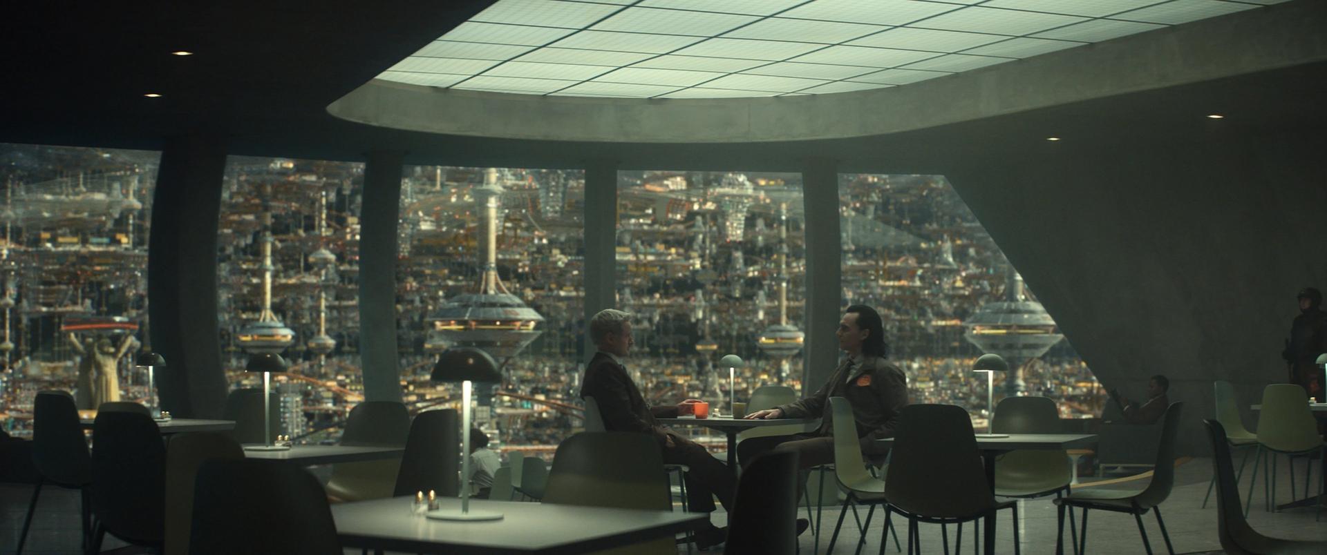
Mobius (played by Owen Wilson) and Loki in the Time Variance Authority headquarters Photo courtesy of Marvel Studios. ©Marvel Studios 2021. All Rights Reserved.
That futuristic cityscape you can see….
Yeah. They had very strange and unique parameters to try to design that. The TVA exists outside of the physical world—so there's no weather, there's no roofs, there's no difference between interior and exterior, there's not necessarily even gravity in the way that we know it. But there are these meandering colonnades that we took a lot of inspiration from Brasilia—and obviously a lot of the super cities that were drawn in comics. But also there's some really beautiful conceptual sketches that Frank Lloyd Wright did of a version Los Angeles in the early 20th century that had Roman-like colonnades and plazas and a lot of that fed into what the TVA expanse is.
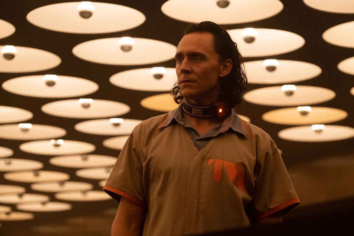
You mentioned all the sets you built for Loki, especially for the TVA. There's two that where used a lot. The Time Theater, where so much of kind of Loki’s personal story gets told, and looks like its straight out of the Barbican in London, with these huge colour-coded directional numbers on the walls. And then there's the Miss Minutes waiting room with those circular lights that looks almost exactly like the lobby of the Breuer building in New York—to the point where I reached out to the museum to ask if you’d filmed there. You even got the silver-tipped light bulbs right.
We were very inspired by that, but it's different in some very subtle, but for me, very important ways. Number one, the size of the bulbs is much smaller, they were manipulated to create eyeballs, basically. Another important difference is that in the Breuer building, they have these dishes hanging in space, whereas in ours, they're negative space, there's a solid ceiling. It creates a matrix of eyeballs peering down, like the always-watching Time-Keepers. And maybe the most important difference is that the ceiling is slammed down—you know the cheapest apartment you can go into has an eight-foot ceiling, this is six inches shorter than that, and our actor is about six-foot-three. The idea was to create a sort of trash compactor feeling in this claustrophobic space with this matrix of eyes, watching as all of this is happening.
The time theater was for me very inspired by Pier Luigi Nervi.
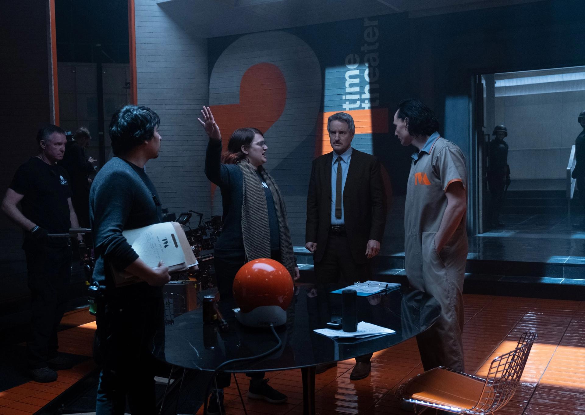
Director Kate Herron, Owen Wilson and Tom Hiddleston on the set of Marvel Studios' Loki, now on Disney+ Photo by Chuck Zlotnick. ©Marvel Studios 2021. All Rights Reserved
I liked that waffle coffered ceiling you have in that room.
Thanks. We were very happy with it, and it created this kind of forest of light columns which helps set the neo-noirish, interrogative nature of the space. And the unnecessarily large super graphics that you mentioned are a very Paul Rudolph sort of a thing, he did that in his building too, and I love that.
For me, it’s very important not to reference a set design from other films, that why I reference architecture, painting, photography, these other art forms, more than anything else, because inevitably when you’re working in archetypes, there’s a lot of overlap.
And as Loki goes into different times and locations, you get a completely different design environment in those places. There’s a scene on a train car, that has a very Art Deco look.
That was inspired by the inside of a Fabergé egg, Art Deco meets Alien.
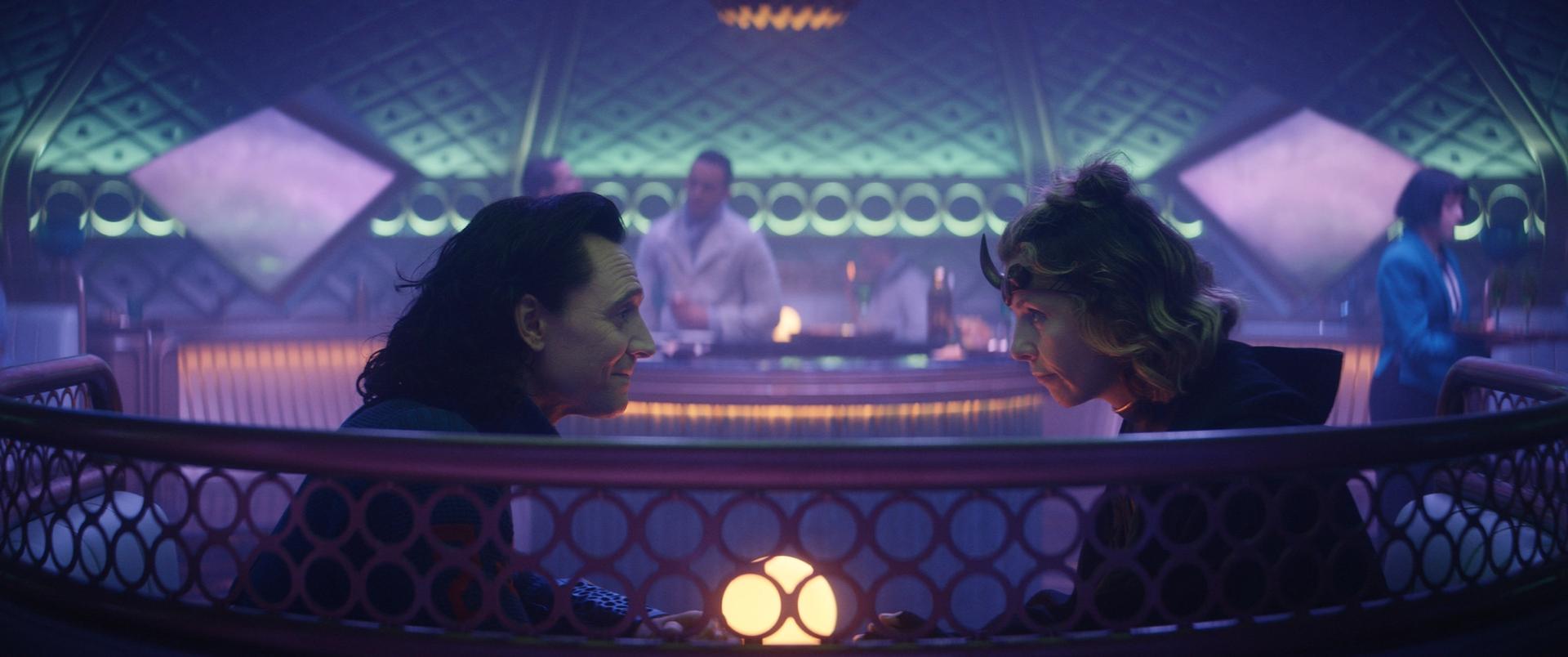
Loki and Silvie (played by Sophia Di Martino) ride in an alien train carriage Photo courtesy of Marvel Studios. ©Marvel Studios 2021. All Rights Reserved
And when you finally meet the Time-Keepers in the most recent episode, it’s like they're in a pre-Colombian pyramid or a ziggurat.
I was looking at Indian stepwells, this almost fractal quality with these descending stairs going into one another—but we imagined them going out every direction, with an Escher-like quality, like they are tessellating themselves to infinity.
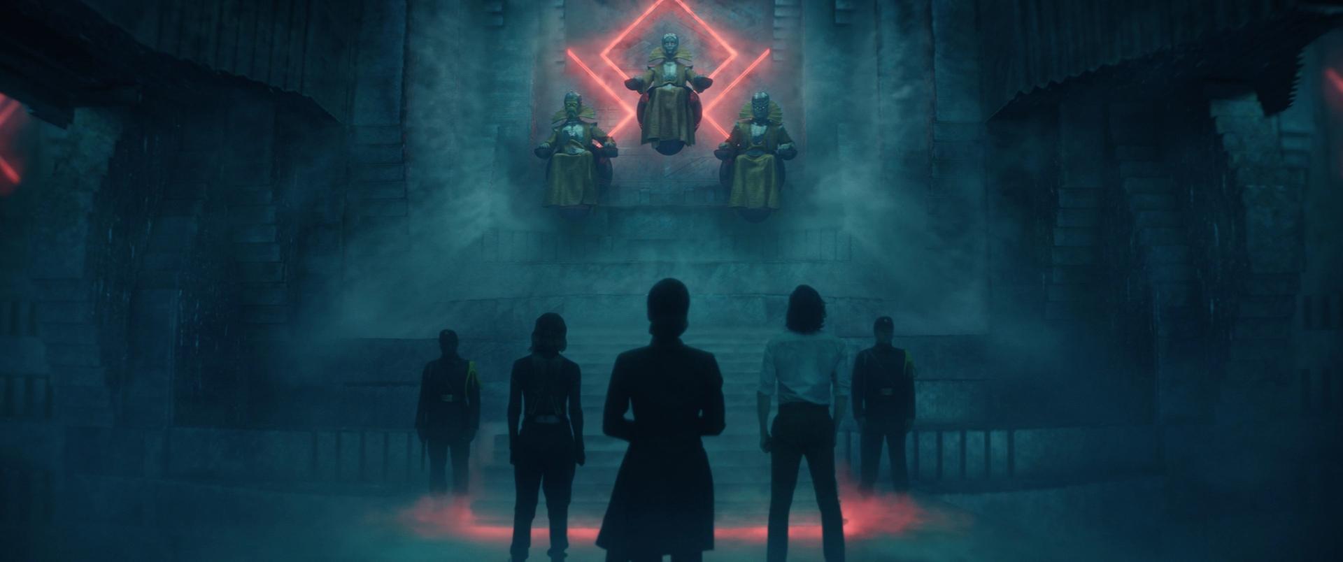
Sylvie (played by Sophia Di Martino), Judge Renslayer (Gugu Mbatha-Raw) and Loki (Tom Hiddleston) meet the Time-Keepers (above) Photo courtesy of Marvel Studios. ©Marvel Studios 2021. All Rights Reserved.
I read on Twitter that you literally bought a bowling alley from Omaha and brought it to Atlanta to create Loki's Palace in the Void in the last episode, which is this crazy, surreal, amusement park, junk yard-like place.
We bought the floor of a bowling alley, everything else we built. That was a lot of fun because the script gave us a lot of runway. The proposal was to do this bowling alley because essentially everything in the Void has been discarded from time, and more things fall into it and accumulate and so you end up with these strata. I liked the idea of like a bowling alley that's been smashed over your knee or something. The net effect is when you first enter, you have all these lane lines pointing down at this throne, which was supposed to be stolen from a mall Santa. And then there's these crazy alien plants that are growing through it that have taken parasitic hold of the place. In many ways, I think its a narrative microcosm of the Void itself, which is like a salad bar of these disparate aberrations slammed together. Things like the bowling alley all have these micro-narratives that we in the art department have come up with to help flush out the design and make them specific. For example, there's portraits on the wall of like bowler of the month, and they’re not quite human. It's not in the episode, but those things are important for us in the art department.
At the very end of the most recent episode, we get a glimpse into this city that Loki and Sylvie (played by Sophia Di Martino) are walking into. Can tell us anything about what inspired those scenes, what we're about to see?
You can call me back in a week. All I can say is that the TVA is definitely the visual and narrative anchor of the story, but there's a lot of great worlds to see. And I think what people are responding to is the breadth of the visual variety of the show. And episode six won't be any different. It's really cool, and maybe some of my favorite stuff.


