Far be it from me to tell another curator what his or her show should cover. The curator picks the theme and makes the argument. I can only say whether or the not the theme was timely and the argument persuasive, ingenious, and coherent. I can speak to the show’s advancement of the institution’s mission. Does it look good? Is the art worth viewing? These are fair questions. Where a show goes off the rails or never even leaves the station, though, I feel free to speculate on what might have been.
I saw two shows in New York recently—the Museum of Modern Art’s Joan Miró, Birth of the World (until 15 June) and the Neue Galerie’s The Self-Portrait from Schiele to Beckmann (until 24 June)—and I would recommend both. The art is enchanting. These shows neither go off the rails nor stall at the station—but they do forget where they are going.
MoMA is doing something old-fashioned, and today that sometimes is thrilling and edgy: it is using its permanent collection. Its Miró holdings are deep and of the highest quality, but the show is not a comprehensive Miró survey since it only covers what the museum owns. As a visitor, you can do a wander-through-the-garden, looking at this or that, and leave having seen some wonderful works you will likely not seen again. The curators can reign with the lightest touch. The decision to do no catalogue, which means no new research, suggests this approach.
To do this effectively, two things still should happen. You need to have a basic Miró primer: who is Miró, what is his trajectory, why might we fall in love with him? Afterwards, the informed viewer is free to take that background and apply it however he or she wishes. The MoMA show is missing that “who was Miró?” moment.
Some observation on why MoMA is blessed with so many good pieces by Miró is helpful, too. MoMA probably feels it has depth everywhere but in Miró’s work the collection seems especially rich, which suggests some special curatorial spark, some passionate collector, some inspired beneficence. The marquee names on the wall text credit lines indicate good stories on provenance. We do not get any of that, however.
The MoMA show instead does something a little daft. It calls itself Birth of the World, the title of a key painting in the show. This is a good double entendre since it anchors the show in one picture but suggests Miró’s primitivism, his use of murky, timeless ciphers and shapes, and a world before reason and logic. When a small show tethers itself to one great painting, though, it needs to put the picture front and center and keep returning to it.
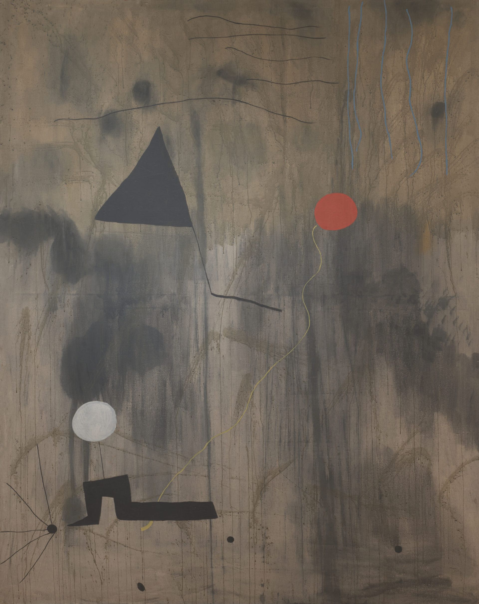
Joan Miró, The Birth of the World (1925) © 2018 Successió Miró / Artists Rights Society (ARS), New York / ADAGP, Paris
I first thought this would be the case. The Birth of the World from 1924, is displayed in the first big gallery, toward the back, on the side, so the viewer sees it from an oblique distance on entering. Design-wise, visitors experience a good set-up before this, seeing Miró developing his “chance and plan” style during his early years. He experiments with controlled pouring, flinging, and brushing paint and gradually reduces references to the tangible world to stylised birds, stars, balloons, and heads.
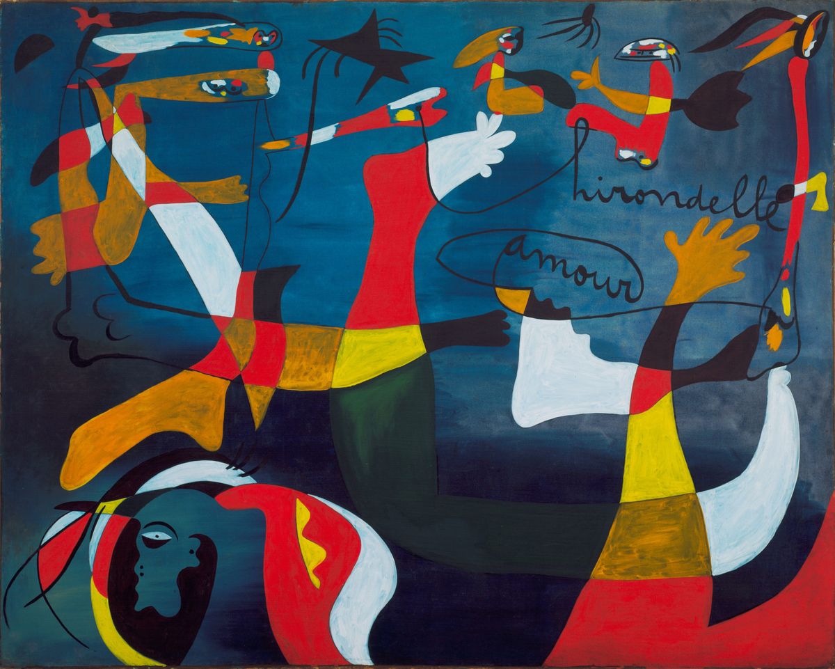
This development works nicely, but the rest of the show loses its connection to The Birth of the World. Its placement looked good when I first saw it across the gallery but on closer view it is really stuck in a corner. You have to move away from it rather than come back to it over and over. By the time we see Hirondelle Amour from late 1933 or early 1934, or the rope pictures, or Miró’s self-portrait sculpture, or little, perfect treasures like The Beautiful Bird from 1941, we have lost the trail that began with The Birth of the World.
The introductory wall text also opens with a passage from a letter that Miró wrote to the French poet Michel Leiris in 1924: “You and all my writer friends have given me so much help and improved my understanding of many things.” This, I believe, is the last thing we read about so-called transformative poetry or the artist’s friends. I don’t think you can launch a show like this and then drop the theme.
I’m afraid that after my first walk through, I ignored the labels and enjoyed the art. I think most people did the same after a few minutes, having realised the curators abandoned the intellectual thread of the show.
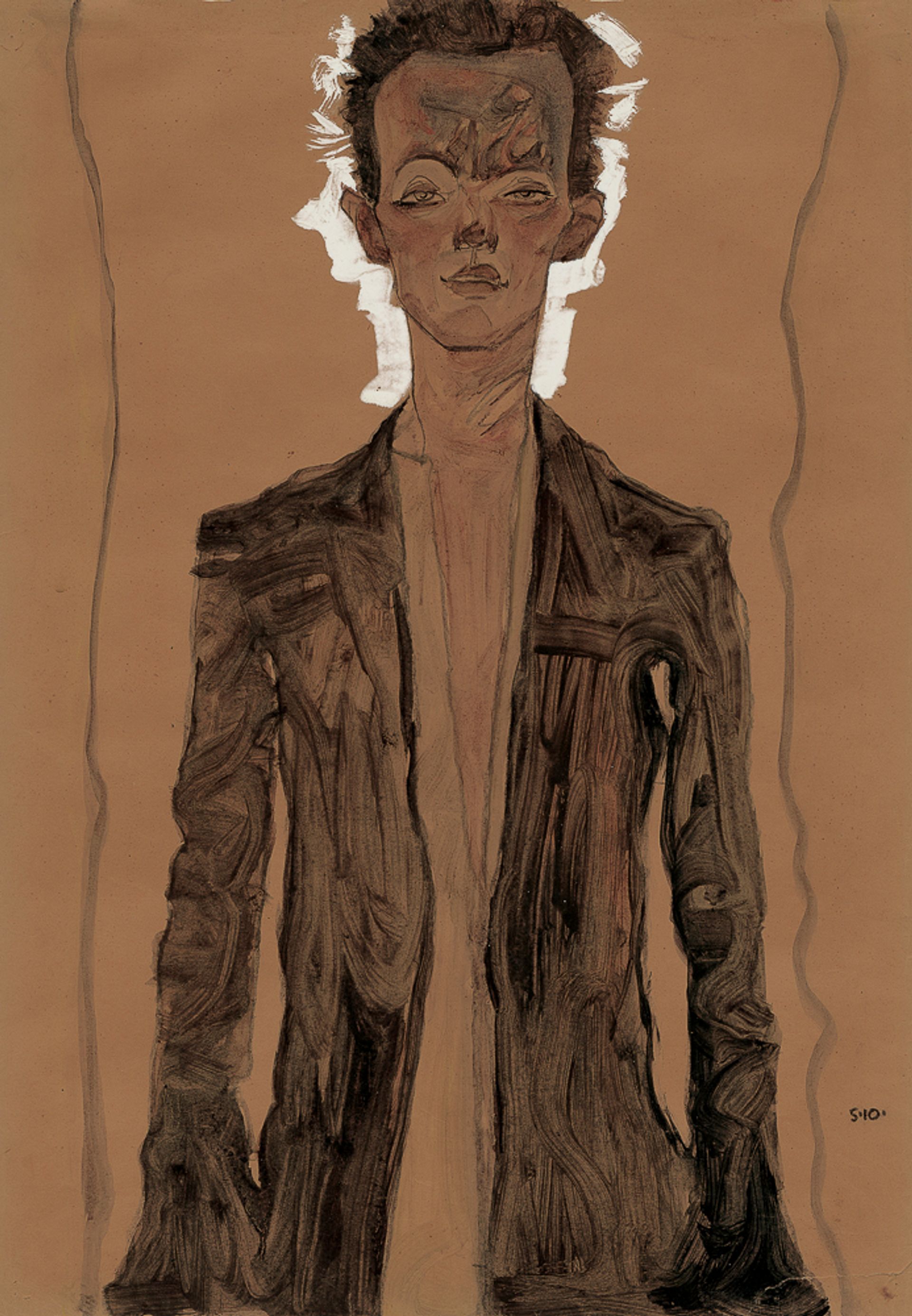
Egon Schiele, Self-portrait in a brown coat (1910)
Meanwhile, the Neue Galerie’s show starts in a deeply impressive way. It presents a fine, new, and refreshingly bounded theme: the self-portrait in Modernist art in Germany and Austria. It dazzles with a first gallery of self-portraits by Schiele compared with the young Rembrandt’s. This is entirely reasonable and smartly done, using Schiele’s drawings and watercolours and a smashing painting, and a set of small Rembrandt etchings on loan from the Morgan Library. The Rembrandts are from the early 1630s, when he was about Schiele’s age, and the scale is complementary. It cleverly endows Schiele with a pedigree and salutes Rembrandt. It is an apples to apples comparison of two very different artists and it is electrifying.
Then the show gets lost. The introductory panel promises us a few things. One is a focus on German and Austrian self-portraits between 1900 and 1945, so we have a zeitgeist. I expected to learn what is different about self-portraiture then and there, and I did not. The period and places offer more trauma than, say, my hometown in the Connecticut countryside in the 1950s. The show promises “confessional portrayals” and the artists’ thoughts on their relationship to society—”They expose deeper truths about the human condition”—and that it would show me by artists I did not know.
Well, I never thought I would get “deeper truths about the human condition” since that’s a squishy proposition. It’s vague and about as reliable as hearing “I’ll call ya” after a so-so date. I did, however, see some very fine work by artists I did not know.
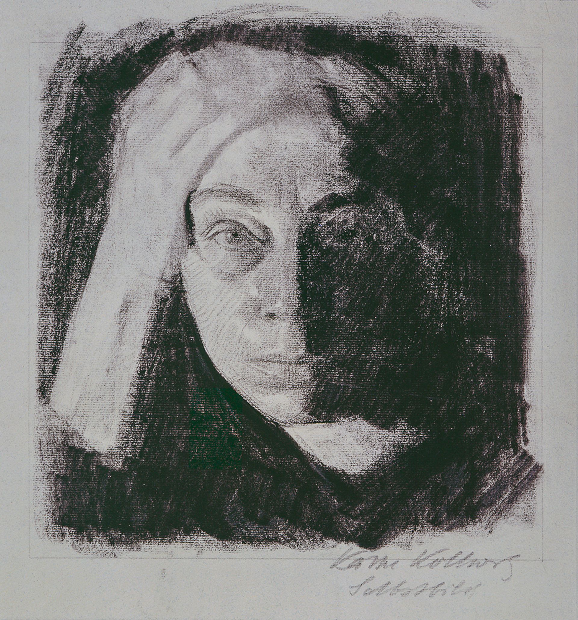
Käthe Kollwitz, Frontal Self-portrait (1910) Käthe Kollwitz Museum Cologne. Photo: Käthe Kollwitz Museum Cologne © 2019 Artists Rights Society (ARS), New York / VG Bild-Kunst, Bonn
The show has three other galleries; two of them on “Expressionism” and “New Objectivity”, broad movements that have nothing to do with self-portraiture. These rooms blur rather than focus the them. The other gallery has work by Paula Moderson-Becker and Kathe Kollwitz. Kollwitz’s works “do not aim to flatter but instead capture how her life experiences indelibly left their mark on her face and psyche”, the wall text says. Her self-portraits are called “searing”, which they’re not; they’re frank and strong but there’s no issue of her breaking gender stereotypes. They’re tough, raw, and angular and entirely consistent with the styles of male peers like Erich Heckel and Ernst Ludwig Kirchner.
Moderson-Becker’s self-portrait shows her pregnant. Was it ever displayed? Was it a gift to her husband? Or was it, like a very expectant Demi Moore’s photo on the front cover of Vanity Fair, a public sensation? This makes a difference in whether or not the picture was, as the curator states, provocative or an assault on “the accepted understanding of gender and motherhood”. The other self-portrait is a bust showing Moderson-Becker holding flowers, and that breaks no barriers.
We also don’t learn anything about her life, Kollwitz’s, or, with a couple of exceptions, anyone else’s. There are splendid work by Wilhelm Heise, Ludwig Meidner, and Rudolf Wacker. Who are they? What is Felix Nussbaum’s story? There are three self-portraits in the show, each is great, and we know he was in a death camp in 1940. Why are there two nearly identical portraits of Ferdinand Hodler? Are Wacker’s portrait and Otto Dix’s pendants? They are side by side, the same size, complementary poses, and done only a year apart.
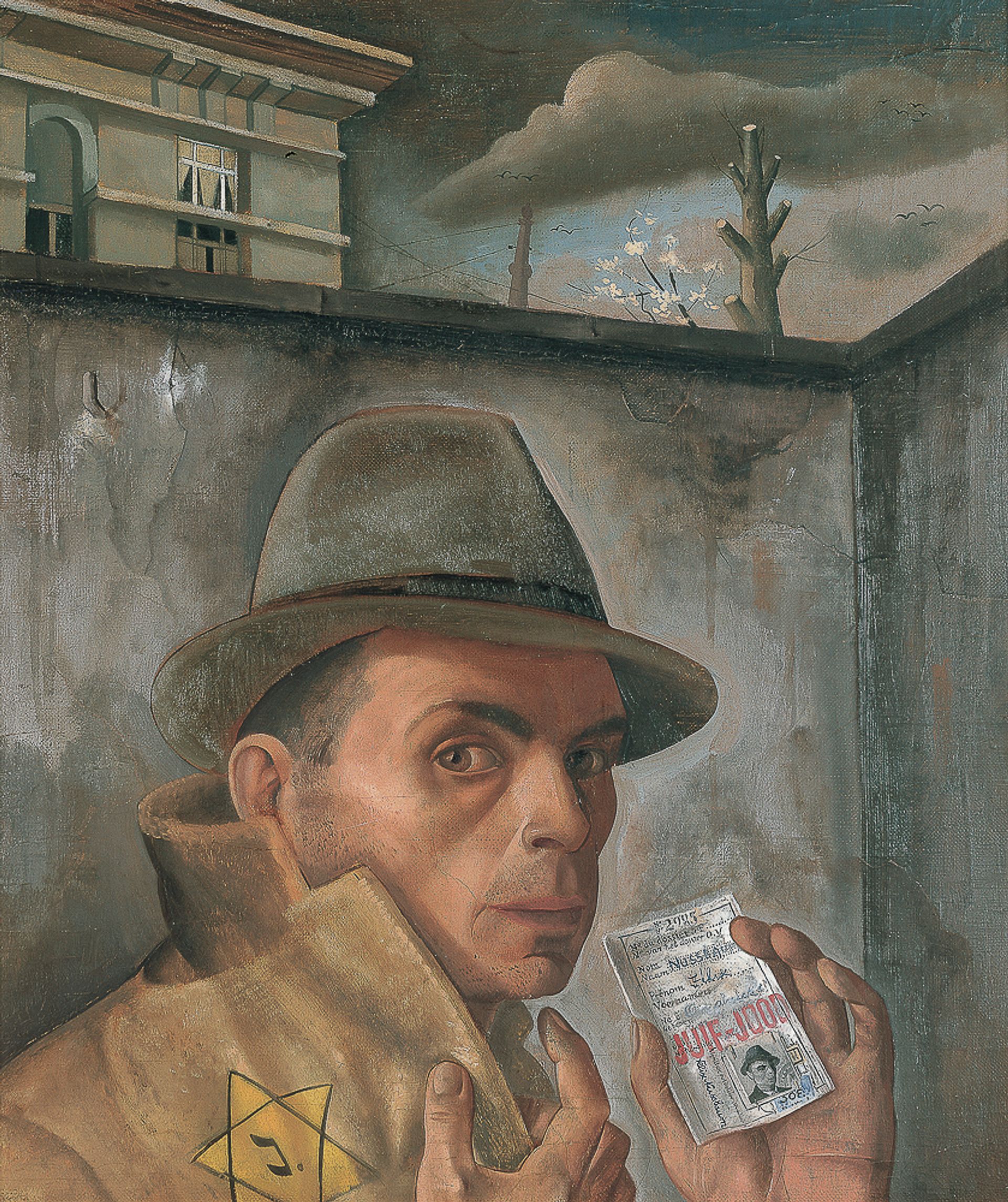
Felix Nussbaum, Self-portrait with Jewish Identity Card (1943) Felix-Nussbaum-Haus Osnabrück, loan from the Niedersächsische Sparkassenstiftung. Photo: Museumsquartier Osnabrück, Felix-Nussbaum-Haus Osnabrück © 2019 Artists Rights Society (ARS), New York
I tend to be an ice cube of the WASP variety. I’d rather walk barefoot on molten glass than hear about “feelings” but at one point I actually yearned for Freud and Jung to rear their heads and toss their curls. This era and these places are all about explosive, intrusive ids and egos. As the radio ad said years ago, “enquiring minds want to know”.
I wouldn’t deter anyone from seeing either show. The art in both is the best. It looks especially good at the Neue Galerie, where everything has a comfortable, elegant Old World feel. The MoMA show has the MoMA look: cold, steely, sleek, and bright. That works for lots of things and it is part of the museum’s brand. Miró has a touch of the prehistoric cave painting, though, and those caves were warm, stony, rough and dark.


