"We’ve lost the ability to look at and appreciate small things,” says Jeff Rosenheim, the curator in charge of photography at the Metropolitan Museum of Art, New York. His lament was expressed as he spoke about his exhibition Diane Arbus: in the Beginning, which began life at the Met Breuer in New York in 2016 and opened last month at the Hayward Gallery in London.
Working with specialist designers, Rosenheim overcame the difficulties posed by the small scale of the photographs for the Breuer show by using distinctive totemic columns to display each work individually and prominently. Instead of getting lost, the photos shone; the Hayward, unsurprisingly, takes the same approach.
The rise of innovative and quirky exhibition design has been highlighted in a wave of recent shows whose elements stick in the mind long after they have closed. Tate Modern’s Picasso 1932: Love, Fame, Tragedy exhibition last year, for instance, used a neat device to delve outside the self-imposed time restriction of a single year of the artist’s output: it included earlier works by recreating the artist’s first major survey, replete with salon-hang, which took place that year.
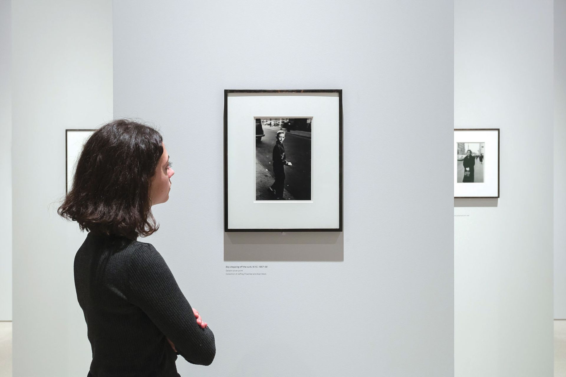
Installation view of Diane Arbus: in the Beginning at Hayward Gallery in London © the artist; courtesy of Hayward Gallery; photo: Mark Blower
Exhibition design can also veer towards the bombastic, with lavish scenography and dramatic lighting usually deployed in sweeping shows on fashion, such as last year’s Heavenly Bodies at the Metropolitan Museum of Art or the current Christian Dior show at the Victoria and Albert Museum. But little interventions may be the most memorable—like the mirror placed under a book in the 2017 Magnificent Gems show at the Morgan Library and Museum, New York, to show off its cover. Books— tactile objects demanding interaction—are notoriously difficult to exhibit.
Some major museums have exhibition designers on staff, while others bring in outside studios. Sometimes third-party assistance is a necessity. Take the unpromising former office block housing The Store X in central London, which has recently hosted vast shows of film and video installations, including 2016’s The Infinite Mix, a collaboration between the Vinyl Factory and the Hayward Gallery, designed by Delvendahl Martin Architects, which required extensive soundproofing and partitioning without blocking a clear path through for visitors.
You often learn from shows you like the least—such as avoiding the dreaded exhibition shuffle
With the vast, noisy and visually vivid moving-image works of those shows, the struggle is to create coherent routes and discrete space rather than gain visitors’ attention. But getting people to pay close attention to smaller pieces is a challenge. Photography is now so ubiquitous a medium that it acts simply as a carrier of information—like words on a page, photographs are skimmed (and not individually scrutinised) to scoop up the information in them. Unimaginative displays can kill even stellar groups of photographic works.
Rosenheim, who has been at the Met for three decades, says he had been trying for years to get people to take time to focus on smaller images. He, the Met’s exhibition designer Brian Butterfield and the photographer Neil Selkirk came up with the idea for the Arbus show of designing a series of freestanding walls with an image on either side—effectively giving each of Arbus’s photographs a wall to itself. According to Selkirk, during the planning process they came to the realisation that it “might enable a very big audience to see those very little pictures”—a way to let thousands of visitors manoeuvre through the space and pay special attention to prints that typically measure around 23cm by 15cm.
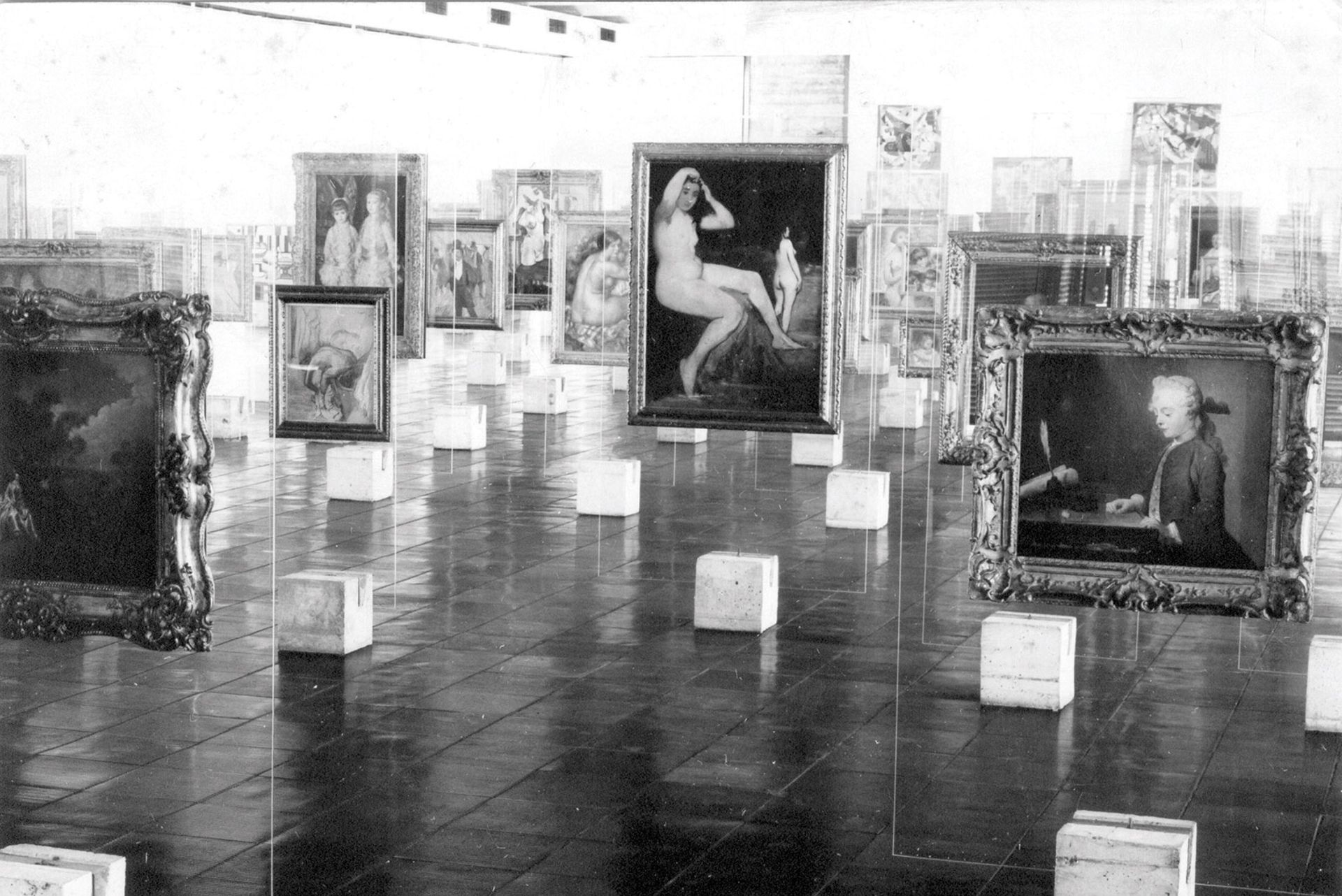
Lina Bo Bardi’s pioneering glass and concrete easels at the Museu de Arte de São Paulo in 1968 Courtesy of Museu de Arte de São Paulo
Rosenheim cites multiple influences for the distinctive layout, from Lina Bo Bardi’s pioneering glass and concrete easels at the Museu de Arte de São Paulo in 1968, to a vast column inside the Neue Nationalgalerie in Berlin—and even some hoarding he saw during a hard-hat tour of the Whitney Museum of American Art. The challenge was to fit in around 100 of Arbus’s photographs—a lot for the space—while still leaving enough room for a large audience to move around (it also needed to be fully wheelchair-accessible). Rosenheim calls the resulting layout “a new way of looking: there is no beginning, middle and end to the show”.
In designing the space, Butterfield looked as far afield as Peter Eisenman’s Holocaust memorial in Berlin, the ancient Karnak Temple at Luxor and the main gallery of Louvre Lens by Sanaa architects. He felt that Rosenheim wanted to include too many pictures in the show—the catalogue had already gone to the printers—and the team spent months testing out layouts before arriving at rows of slabs interspersed with larger spaces. The gallery walls, meanwhile, remained bare.
The layout was also able to play off the unique setting of the Brutalist building designed by Marcel Breuer, with the coffered grid ceiling providing guidelines for the partition walls. Butterfield says it is “one of the first examples in the 1960s—following Louis Kahn’s Yale Art Center—that really tried to present flexible exhibition space as part of a museum typology”.
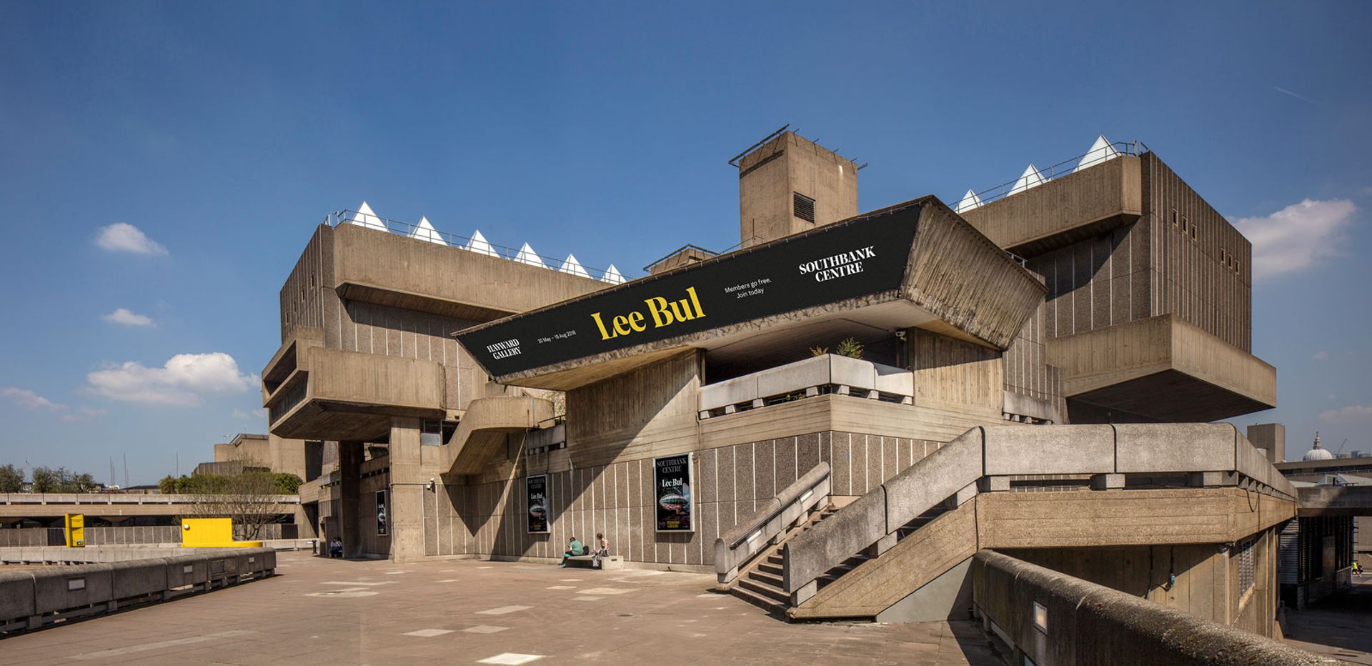
The Hayward Gallery, which celebrated its 50th anniversary last year Photo: Morley von Sternberg
The Hayward Gallery is another exemplar of mid-1960s Brutalism. Here, the show is spread over two galleries, and the slightly broader slabs have become 3.3m-high plinths, painted light grey, surrounded by bare walls painted a midnight blue.
The layout encourages an intimacy with the works and demands attention. I had looked many times at—and even written about—Arbus’s portrait titled Jack Dracula at a bar, New London, Conn. 1961, but it was not until this show that I noticed the small goatee on the tip of his chin. More small details play out on the surfaces of the grainy photographs: the barbershop doormat that reads “Hair tonic, your hair’s best friend”; the tiny toes of a new-born baby flexed and spread out with the effort of screaming (or yawning?).
The layout disrupts standard exhibition choreography. You may set off on a linear route, but an image distracts you, pulls you off track; you double back, wonder whether you have seen something already, perhaps miss things and find them later. You simply have to pay attention.
Rosenheim says the layout “forces everyone to be active, to experience even a small thing one-on-one, which is just like Arbus did”. The late US photographer spent considerable time getting to know her subjects, becoming intimate with them. The other, unexpected outcome was that the layout inadvertently prompted conversations between strangers. “Visitors were asking each other: ‘Did you see that?’” Rosenheim says.
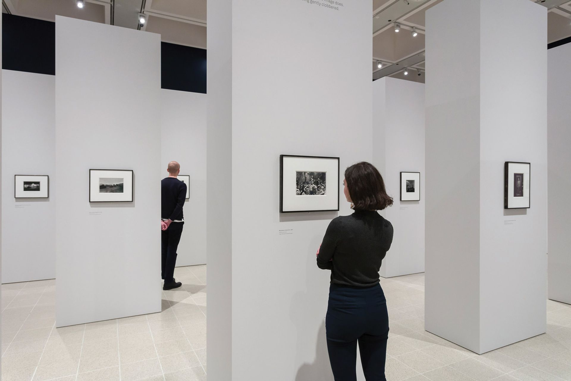
A wall of their own: a series of partitions at the Diane Arbus: in the Beginning show at the Hayward Gallery allows the photographs to be displayed individually © the artist; courtesy of the Hayward Gallery; photo: Mark Blower
The Barbican Art Gallery, another Brutalist landmark in London, hosted a show last year on the US photographer Dorothea Lange, best known for her images of the Great Depression. It was designed by Mary Duggan Architects—the first such job for this new firm. “I like to work with architects who haven’t necessarily done many exhibitions,” says the show’s curator Alona Pardo, who hopes they can “reinvent the wheel”. Pacing an exhibition and telling a story are important, especially with a survey like the one on Lange.
Will Guthrie, the lead architect for the show, explains that each gallery for the exhibition was designed to be a different size—”we had points of compression and decompression”—and offer a distinctive environment to reflect the shifts in Lange’s body of work and the narrative of her life. For example, the first room reflected Lange’s early life and was painted a dark green, with domestic details like skirting boards, and a cut-out into the next gallery mimicking a window on the outside world. The latter was inspired by a story Lange told—her “epiphany”, Guthrie calls it—when she was running a photography studio in San Francisco. Looking out of the window, she saw an unemployed man as the Great Depression began to show on the streets of the city. She grabbed her camera and took to the street to photograph him, thus beginning her remarkable career.
By contrast, the galleries housing Lange’s Depression-era images were pared back, with bare stud walls, and skirting conspicuous by its absence. Most of these details were subtle, but more noticeable were the shadows cast by wooden slats across the open ceiling of a gallery containing her images of the internment of Japanese-Americans during the Second World War. Working with the Barbican’s lighting designer, Guthrie says the aim was to mirror the shadows in the photographs of the camps. Guthrie adds that the team wanted the “idea of containment” to be recognisable in the space, with the proviso that the spaces were not “overly themed”, which can be “insensitive to the works”. A much more “subtle representation of the work” came in a gallery displaying Lange’s black and white photographs of wartime shipyards in Richmond, California, which was painted “the regulation colour of US naval ships at the time”, Guthrie says.
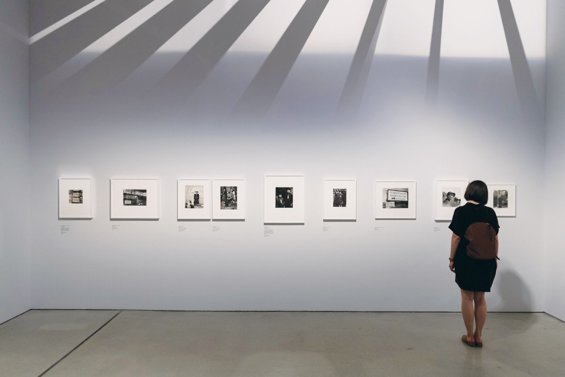
For its Dorothea Lange show the Barbican Art Gallery had prison bar-like shadows cast on its walls © Ian Gavan; Getty Images
Pardo explains that the curatorial team agonises over exact shades of paint, what they evoke, how they can be used to create narratives, such as in the Vanessa Winship show in the Barbican’s upper galleries, concurrent to the Lange show, where each room became consecutively lighter.
Exhibition design comes with its imperatives too. Key issues include access, health and safety, and protecting the works. For example, photographs have to be placed behind 18mm-thick glass for protection, Pardo says. And the nature of the environment—the Barbican, for example, is a listed building—poses further challenges. The “space is so muscular and bold”, Pardo says. “You can’t do anything to the floor [or] directly attach to the ceiling,” Guthrie adds.
The design process often begins a year before a show opens. “We [the curators] determine the structure, the narrative,” Pardo says, while the architects “come up with a framework”. As well as using 3D modelling for initial concept designs and to understand sight lines, physical models are made and the team “cut out tiny images and play with them in the space”. Asked about shows that have inspired her, Pardo says that “you often learn from shows you like the least”—for example, avoiding the dreaded “exhibition shuffle”.
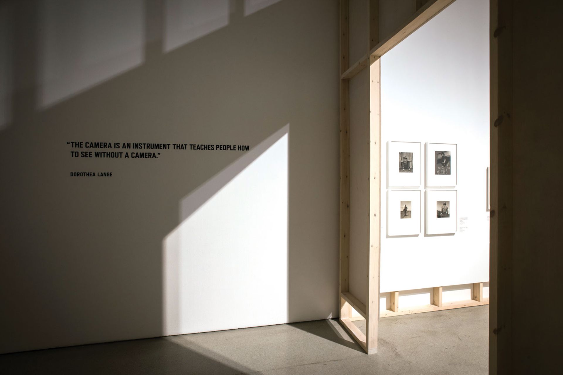
Installation view of the Dorothea Lange show at the Barbican Art Gallery © Ian Gavan; Getty Images
For an architect, the main attraction of working on an exhibition is “the pace of delivery”, according to Guthrie. Architecture is “usually painfully slow”, but with exhibitions the process from initial idea to realisation is much quicker, which may explain why many smaller architectural firms are joining the fray. “It’s sort of architecture sped up ten times,” he adds. The key is being able to tell the story, to provide a narrative for the particular works. “In the early 21st century the imperative to narrate stories about different cultures through the display of objects and ideas is increasingly important,” says Graeme Brooker, head of interior design at the Royal College of Art (RCA) in London. The programme runs an exhibition design pathway. Although Brooker acknowledges the growing number of architecture practices working on exhibition design, he argues that “interior designers, along with curators and experience designers, are the people who have the real insight into realising ideas about the numerous cultures of display.”
He points to state-of-the-art ways of bringing alive art that is thousands of years old. “I think the Lascaux Caves project by Casson Mann is one of the new wonders of the world; to simulate the experience of a space that can no longer be entered is an incredible idea and a spectacular narrative-making exercise.” The design practice was founded by Dinah Casson, who runs the RCA’s exhibition design module.
Brooker also points to a more unexpected direction for exhibition design. “The work being undertaken in retail design is now a fundamental aspect of exhibition design,” he says. It is a compelling point. What, after all, is retail design for but to capture the rapt attention of the viewer? It is the kind of close scrutiny that Rosenheim sought for those small yet vivid Arbus photos.


