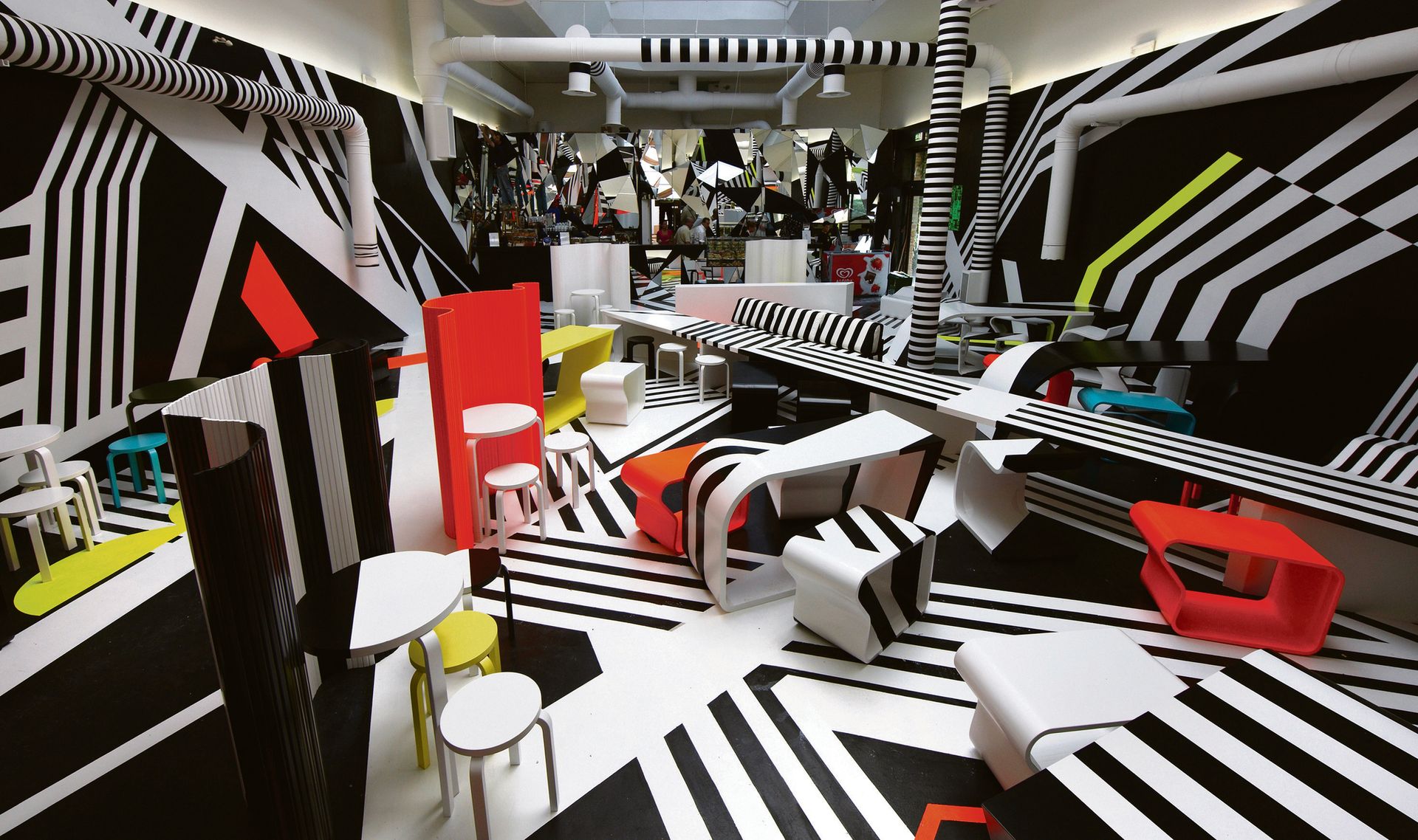
The sculptures, paintings and installations of the German artist Tobias Rehberger are impossible to pigeonhole, often blurring the boundaries of art, design and architecture. Rehberger won the Golden Lion at the 2009 Venice Biennale for his Op art-style cafeteria and brought a vertiginously striped replica of his favourite Frankfurt bar to New York in 2013. His “dazzle” camouflage graphics have adorned a British First World War ship.
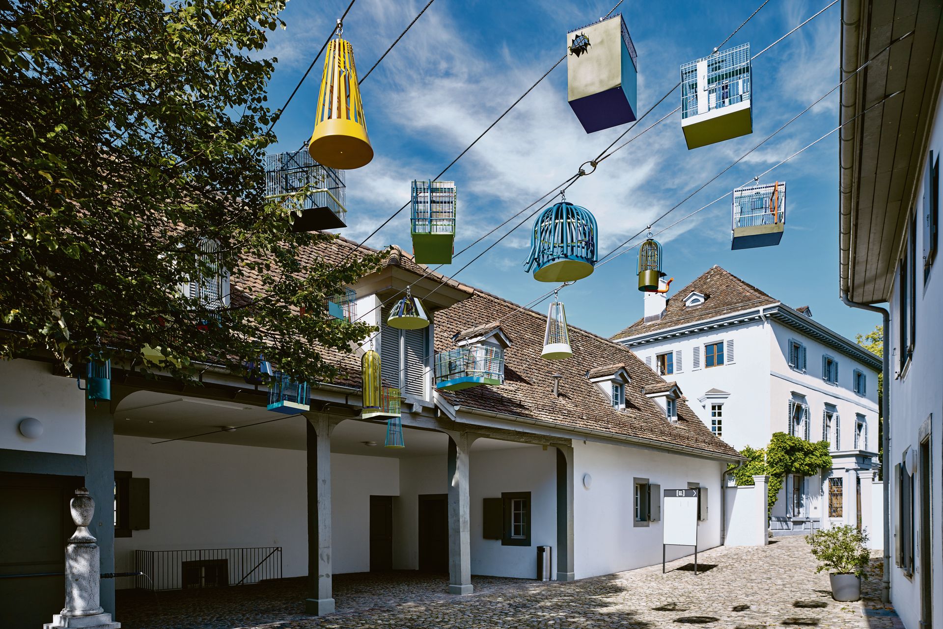
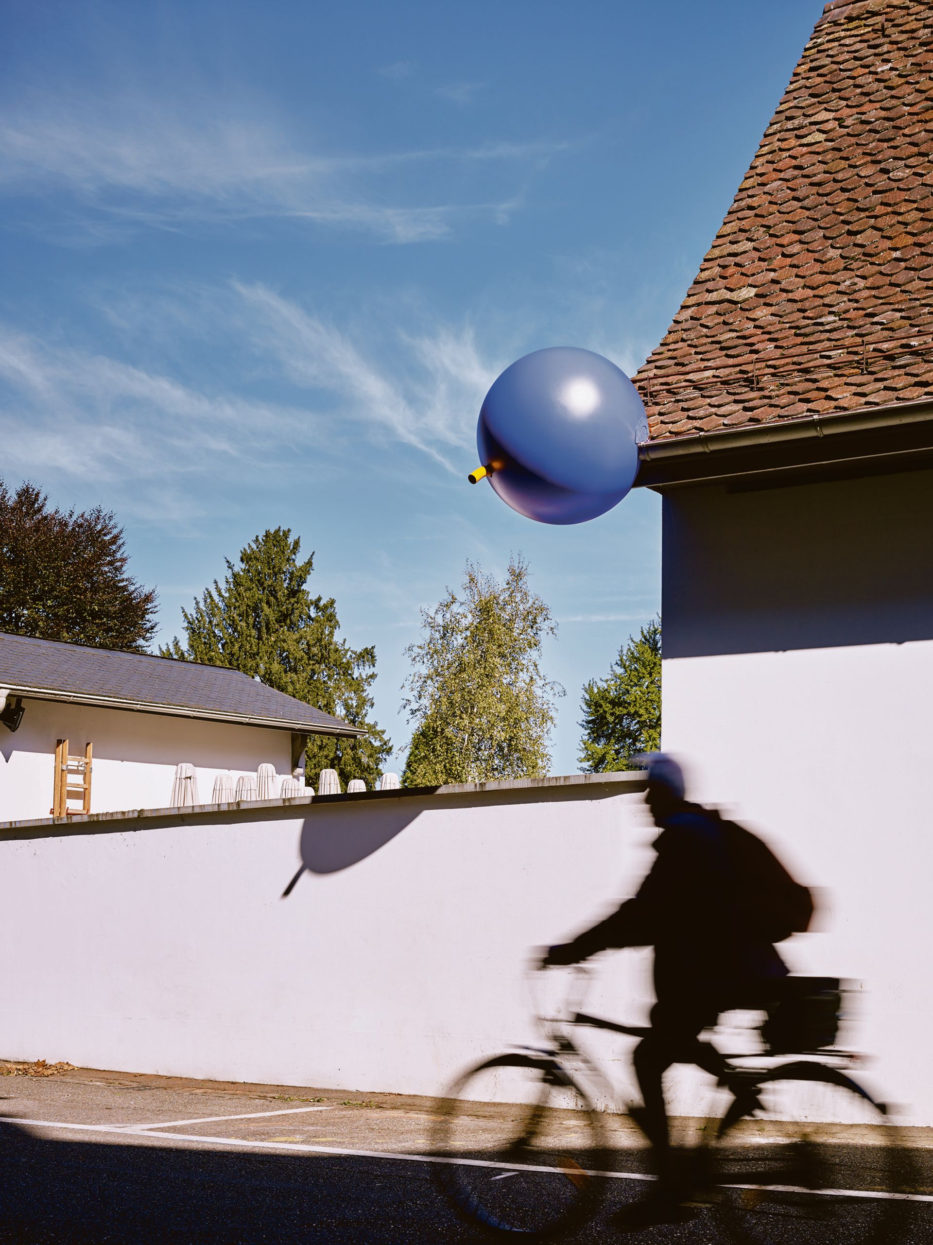
At the weekend, Rehberger stepped outside the white cube again to launch the second phase of 24 Stops: Rehberger-Weg, an art trail along the 5km path between the Fondation Beyeler in Basel and the Vitra Campus in Weil am Rhein, Germany. Co-commissioned by the two institutions and sponsored by Swatch, 24 “way-markers” designed by the artist—including bells, bird cages, cuckoo clocks and beehives—will be in place for the next decade.
Rehberger, who is represented by Galerie Urs Meile and Neugerriemschneider at Art Basel, tells us how these sometimes functional, “in-between” objects can bridge borders, subvert expectations and inspire weary fairgoers. He is in conversation with Theodora Vischer, the senior curator of the Fondation Beyeler, at the fair on Thursday 16 June.

The jury at the 2009 Venice Biennale awarded the Golden Lion to your cafeteria in the central pavilion “for taking us beyond the white cube”. Do you prefer to work outside conventional gallery spaces?
It’s not really a preference. I like to do shows in museums and galleries, but I also like to work under very different circumstances. It’s a good challenge.
The white cube was created so that it might be a neutral space, which I think nowadays we know is never true. No matter how white it is, it’s always social, it’s always political, it’s always something. In that sense, I don’t approach projects in public spaces differently.
I’m interested in the idea that art is more of an everyday experience that you could also have in a museum if there wasn’t such a confrontational structure. You go there, you stare at something and you go home. I want to hang out with art.
What’s the idea behind the Rehberger-Weg?
It creates a kind of guiding system from one museum to the other. To do this without writing “go left” or “go right”, the objects have to be obvious. I was trying to find a formal language that is very different from the surroundings, so that you go almost magnetically from one to another.
Some objects look like abstract sculptures but they have a function, while others are more figurative and have no function. They’re problematic because they’re in-between, they’re ambiguous. They seem to be this or that, depending on how you look at them. It’s very much about our perception.
The walk connects Switzerland and Germany. Did you want to comment on themes of borders and national identity?
The path runs through a protected area, which has probably been part of the surroundings of Basel and the Black Forest since well before the customs house was installed. You do not notice a change in the landscape if you walk along the path, but sometimes you do when you look at the architecture. Setting up the way-markers has, in fact, revealed the connections that have always been there: between two countries, between two villages, between two institutions. The borders are mostly in our heads.
Many of the objects are functional, but in a playful, absurd way. Was it important to introduce humour?
24 Stops is about taking the time to look around, appreciating a landscape that can be both cultural and natural. Sometimes the way-markers could almost be quotations or parodies of the real things. But, in fact, they function just like the way-markers you would encounter anywhere. They incite a sense of curiosity and discovery.
The odd colours and their resemblance to utilitarian objects question what we know. They are disorienting and reassuring at the same time. Sometimes they have a life of their own, or suggest another end to the story, like the bird cages from which the birds have already escaped, or the high perch that dwarfs everyone climbing on it.

What inspired you about the cuckoo clock?
Is there anything more quintessentially Swiss than a cuckoo clock? It is somehow the perfect fusion of technology and nature—an object imitating the call of a bird, but in this case also almost behaving like a bird [Rehberger’s cuckoo clock on the roof of the Herzog & de Meuron-designed Naturbad Riehen has hands that open and close like a bird’s beak]. So, again, it is about blurring the lines as much as it is about blurring borders.
There are bird cages and beehives too. Why did you involve wildlife as well as people?
The attention on the area and its inhabitants—the flora and fauna—is an integral part of the project. It is about subverting expectations: the birds have flown away and regained freedom, while the beehives do not look natural, but they can become a natural home for bees.
The countryside between south Germany and Switzerland is truly beautiful, full to the brim with plants, flowers and animals. Its quiet and sunny character is in stark contrast to the excitement happening during Art Basel. It calls out for you and suggests that maybe you can take a break… it’s better air than inside the Messe Basel.
Do you plan to visit the fair?
I don’t usually go to art fairs. I will probably [go to Art Basel] to check how my work is installed. But I always get a bit depressed at fairs. There’s so much unco-ordinated artwork that hangs around like ham. It’s not an exhibition, it’s just things on paper walls. I understand the necessity of it and why people go, but for somebody who produces, you think so much about the details and then the work is neutralised.
What future projects are you working on? Do you have any dream projects that you haven’t yet been able to do?
I don’t like [to talk about future projects] because I’m always a bit superstitious. In June, there’s the opening of a 16-hectare park in the countryside in Holland that I designed. It has what you would call sculptures, but I see the whole thing as one work. It’s called Vijversburg.
I’m also working on a sculpture that is a butcher’s shop in Berlin, like the cafeteria in Venice. That’s my next dream project.

Tobias Rehberger: three key works What you love also makes you cry (2009), Venice Biennale
For the 53rd Venice Biennale, organised by Daniel Birnbaum under the title Making Worlds, Rehberger transformed the former Italian pavilion into an eye-popping environment that is also a permanent bar-cafeteria. The disorientating mash-up of geometrically patterned surfaces, mirrors and custom-made furniture (produced in collaboration with the Finnish brand Artek) won him the Golden Lion for best artist. Rehberger drew inspiration from the “dazzle painting” style used to camouflage British battleships during the First World War.
1661-1910 from Nagasaki, Meiji, Setti (2015), Fondation Beyeler, Basel
At last year’s Art Basel, Rehberger unveiled another kind of optical illusion at the Fondation Beyeler. His mural of wallpaper tiles appeared as an abstract sea of coloured pixels close up, but revealed itself through a smartphone lens as a series of erotic scenes based on Shunga, the sexually explicit genre of early Modern Japanese art. In December 2015, Rehberger and the Beyeler presented a new version of the installation at Art Basel in Miami Beach.
Presently (2016), Neugerriemschneider, Berlin
Rehberger invited more than 60 artists who have influenced him over the years—whether as friends (Rirkrit Tiravanija), mentors (Martin Kippenberger) or students (Danh Vo)—to contribute a work to a group show at Neugerriemschneider during Berlin Gallery Weekend this year. He responded to each one with a personalised paper sculpture containing a gift of his own. The exchange echoed Rehberger’s first solo exhibition at the gallery in 1995, when he asked all the artists on the roster to send a bunch of their favourite flowers, displaying them in vases he had created for them as individual portraits.
• Artist talk: Tobias Rehberger in conversation with Theodora Vischer, Thursday 16 June, 1pm, Auditorium, Hall 1

