If painting had a spiritual home, it would probably be Venice. That’s a contentious claim, I know, but few other cities have had such an impact on the history of Western art. For around 100 years from the 1480s onwards, Venice was home to advances in painting that changed the way people made and thought about art for ever.
Why? Two things: human genius and water. The latter is an often overlooked aspect of the city’s cultural history. Venice’s mastery of the sea, and the security provided by her watery isolation, led to a concentration of wealth, and with it came a strong appetite for art. The limited space for ostentatious decor (gardens, for example, were out) necessitated a city of rich interior visual display. And because damp walls meant that frescoes soon crumbled, large-scale works had to be made on canvas, leading to a broader, quicker style of painting. (Canvas was in abundant supply, thanks to all those local sailmakers.) Meanwhile, merchants brought the finest pigments from around the world, beginning Venetian art’s reputation for vivid colour.

For centuries, artists and tourists have paid homage to Venice’s Renaissance masterpieces. Here, I want to focus on five works, by three artists, which help to chart some of the great advances in Venetian art. Crucially, all of the works are still to be found in the spaces for which they were created, enabling us to see them as the artists intended. Visitors to the Biennale might call them “site-specific installations”.
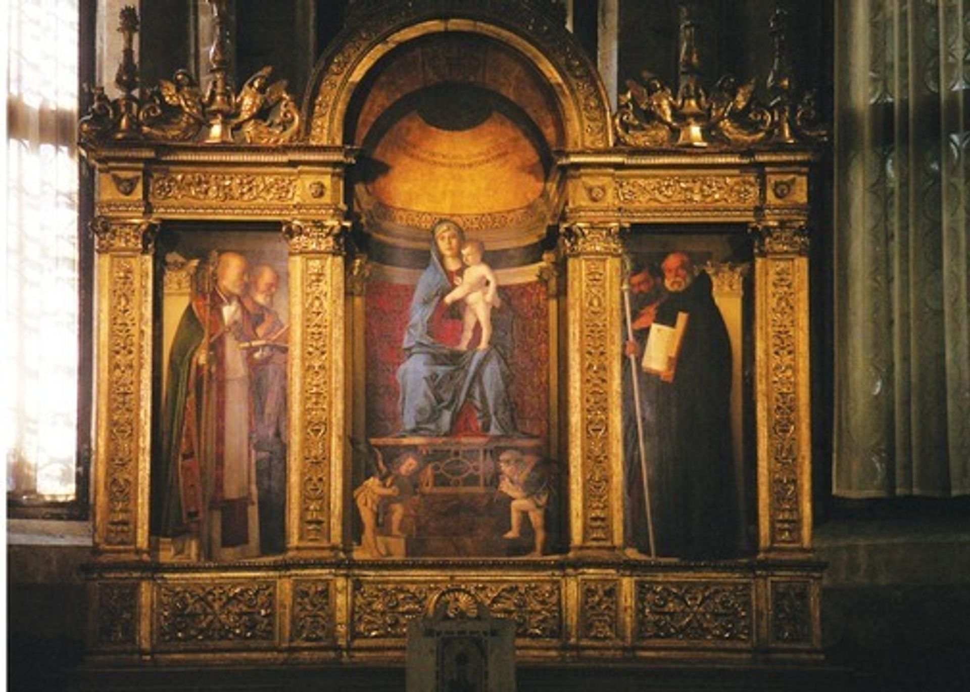
In the presence of God First, to the Frari church in San Polo. In the sacristy hangs an extraordinary work by Giovanni Bellini, the father of Venetian art: his Madonna and Child with Saints, 1488. As an early proponent of painting in oil, as opposed to egg tempera, Bellini mastered new, highly realistic ways of depicting the human form, primarily through the use of glazes. These translucent layers of oil and colour enabled him to portray light and flesh with unprecedented fidelity. He enhanced the effect by using “integral” frames, which mimic the architectural details in the work and create a three-dimensional illusion. The aim was to persuade your average late 15th-century Venetian that they were in the presence not only of the saints, but of God himself. Dürer probably saw this work when he visited Venice in 1505 and declared Bellini to be the greatest painter who ever lived. The effect is still mesmerising today.
The Virgin as a rocket ship A defining early work by Bellini’s most famous pupil, Titian, also hangs in the Frari, over the main altar. Titian’s Assumption of the Virgin, around 1516 to 1518, was then, and still is, the largest altarpiece in Venice, and its scale and ingenuity astonished his contemporaries. Where Bellini painstakingly crafted quiet, pictorial fidelity, Titian added drama. The work is a swirling mass of bodies, limbs and action, in which the Virgin is propelled heavenwards like a rocket ship. As you walk towards it, your eye is guided upwards thanks to the two saints in red beneath the Virgin; Titian placed them in such a way as to form a triangle of colour with the Virgin herself, who also wears red (albeit with a blue shawl, as tradition decreed). And although the work is strongly lit by windows on either side, it is also cleverly lit from within, thanks to a vivid shaft of sunlight silhouetting the Holy Father. The device was dramatic, but also, for an early 16th-century audience, reassuring, for it provided an echo of the Byzantine gold mosaic arches that had, until then, dominated Venetian church architecture.

Such inventiveness was unheard of in its day, and pictures like the Assumption sparked an important artistic debate: which was better, the disegno (drawing) of a painting, or its colore (colour)? Advocates of disegno, such as Michelangelo, based in central Italy, believed that the most important part of any painting was composition, which should be meticulously crafted through preparatory drawings. Titian and his fellow Venetians, on the other hand, emphasised the application of colour in skilful, often flamboyantly visible brushstrokes.
Consequently, drawings by Titian are rare. He preferred to start painting straight onto the canvas, often making alterations as he went. Today, as the top paint layers fade, these pentimenti are sometimes visible to the naked eye.
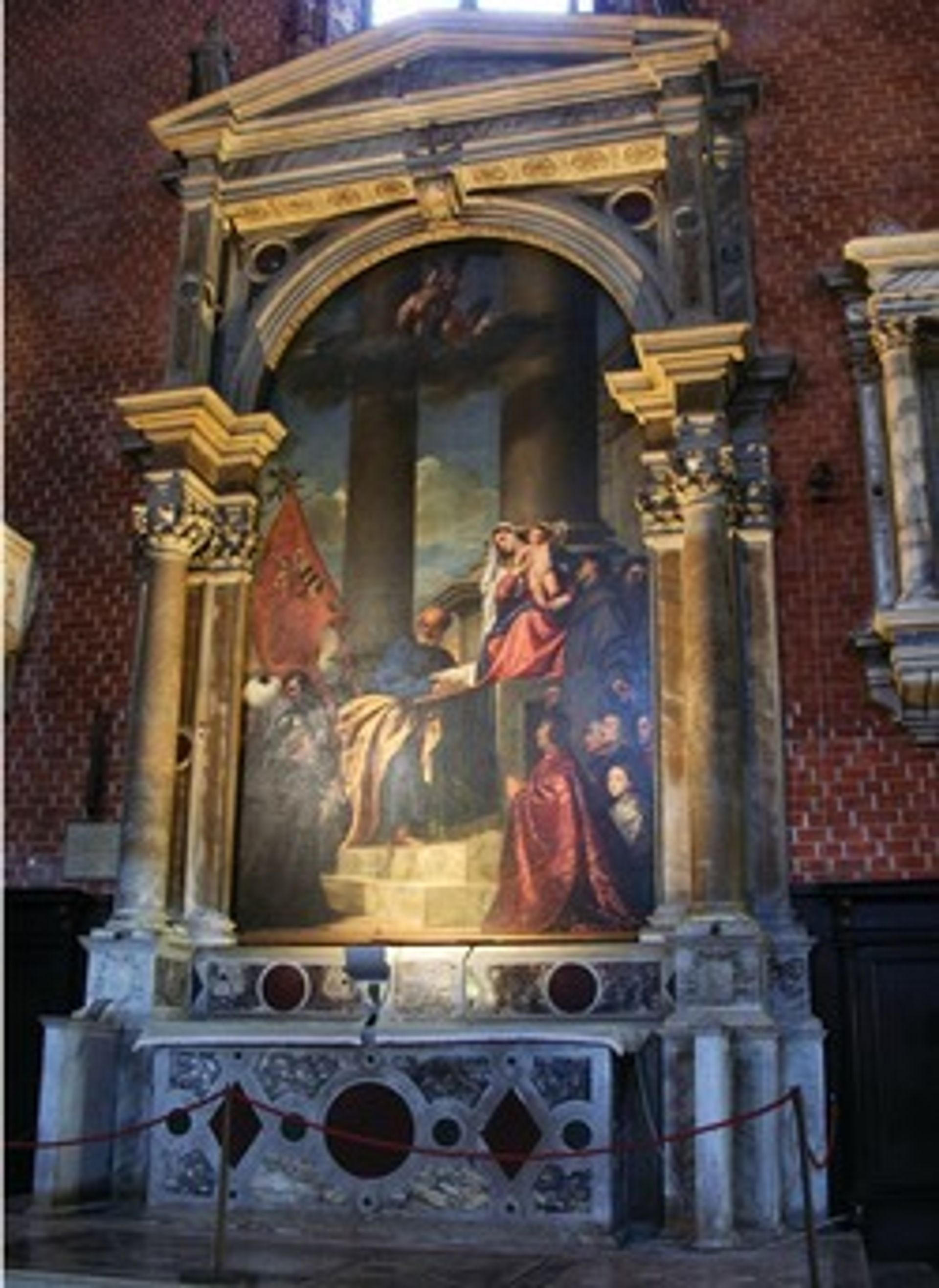
If you look at Titian’s Pesaro Madonna, 1519-26, which is also in the Frari (in a chapel to the left of the Assumption), you can see various ghostly columns beneath the sky, where Titian altered the background. Like Bellini’s sacristy altarpiece, the Pesaro Madonna relies on an actual architectural structure outside the picture to help create a three-dimensional effect. But Titian is noticeably less concerned than Bellini with fooling the eye; one of the columns within the picture is not even straight. Instead, as befitted his new belief in the strength of colore, the main draw, so to speak, is the animation and interaction of the figures.

Tintoretto’s attack on the canvas An artist who took the colore approach to its most extreme, and was heartily disliked by disegno advocates, was Jacopo Tintoretto. He was nicknamed Il Furioso for his rapid painting technique, seeming almost to attack the canvas with his brush. The artist and art historian Giorgio Vasari, a strong advocate of disegno, was bewildered by Tintoretto’s approach, but also awestruck, describing him as “extravagant, capricious, quick and resolute, with the most ferocious brain that painting ever had”.
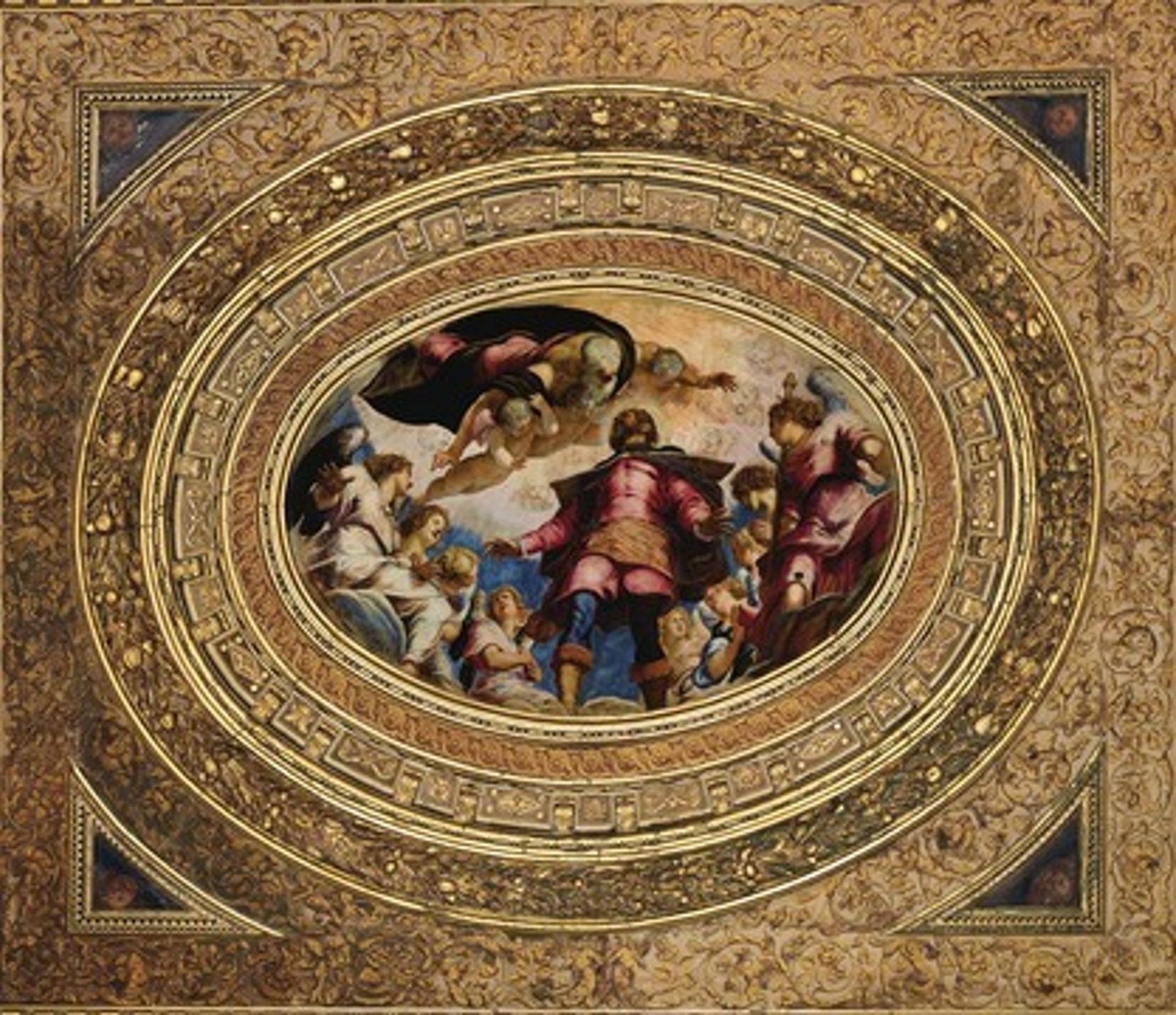
Tintoretto’s ability to paint quickly helped him secure a crucial commission—for a wealthy guild, the Scuola Grande di San Rocco—and transformed his career. In 1564, the Scuola held a competition to decorate its new premises, asking four artists to submit studies showing how they would depict its patron saint, San Rocco. Tintoretto decided not to bother with the study, but simply painted a full-scale, finished picture. He cannily showed San Rocco ascending to heaven, in a deliberate echo of Titian’s Assumption in the Frari, and with the same colour scheme too, knowing that the Scuola liked Titian’s work. But he then did something very bold: he secretly had the work installed in the room in which it was to hang, and declared that he had donated it to the Scuola, gratis. Being a charitable organisation, the Scuola could not refuse a gift, and so the work remained.

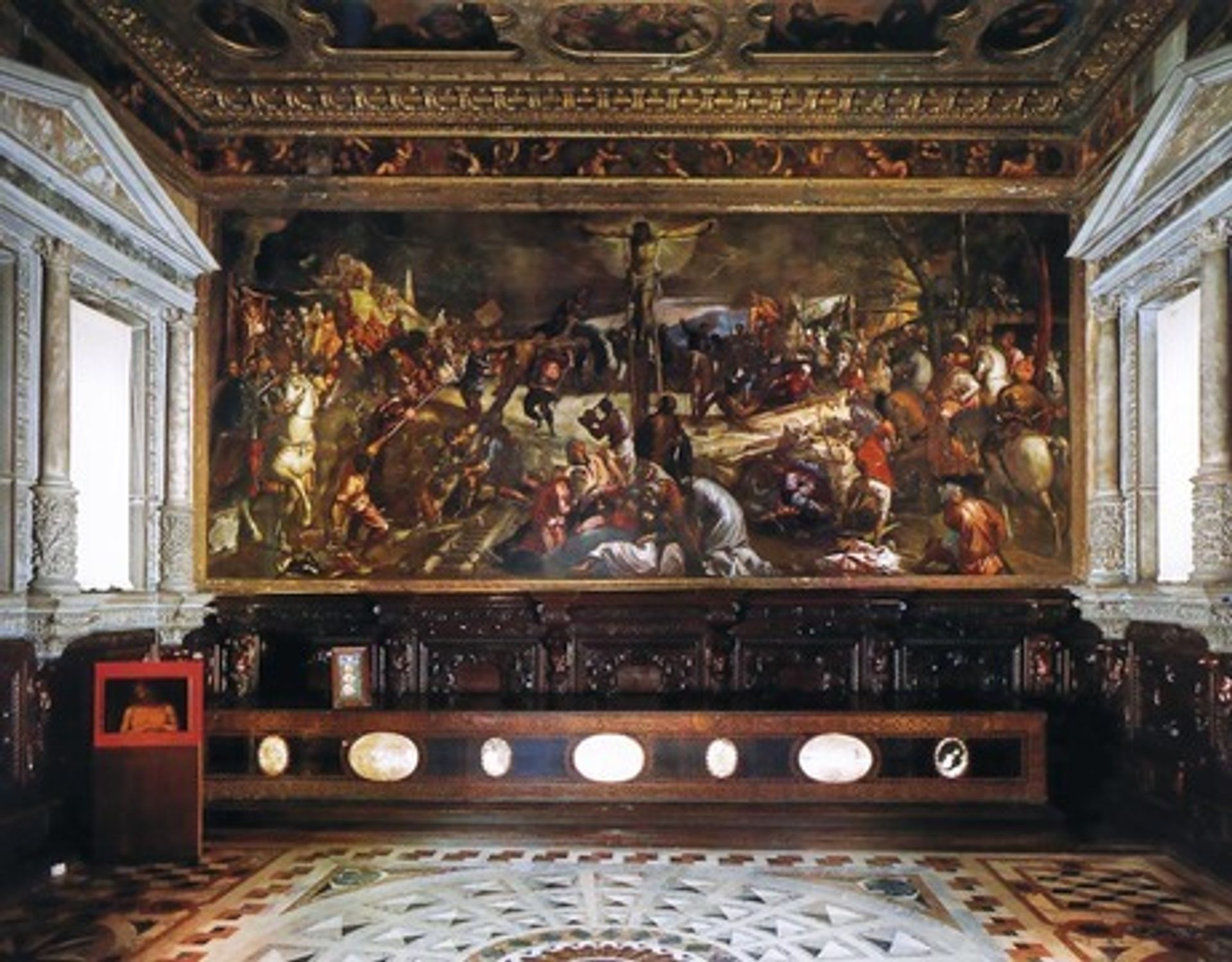
Renaissance drive-in cinema Tintoretto then secured the commission to decorate the rest of the Scuola, which he worked on for more than a decade. In the enormous Sala Superiore, for example, virtually every painted surface is by him (and all are on canvas). But his undoubted masterpiece is the enormous Crucifixion, painted in 1565. It is said that, rather than make preparatory drawings, Tintoretto sometimes used small models of wax or clay, which he would arrange in artificial light. In the Crucifixion, the lighting is theatrically over the top—like a Renaissance drive-in cinema.
In fact, the work breaks all the traditional rules of painting; there are multiple viewpoints, and the action is so frenzied as to be almost overwhelming. But its sheer genius carries it through, and what it loses in compositional purity, it gains in spontaneous virtuosity. It is a vivid demonstration of why the colore school, and Venice, ultimately won the Renaissance’s greatest artistic debate. Thus was a revolution in art created by a soggy lagoon.

